
I do my best work on problems I believe in.I’m looking for the next one.
I’m a Principal Product Designer who cares deeply about the work. I move fast, and I’m told I can look intimidating until I start talking. My friends say it’s because I’m always thinking.For what it’s worth, I’m also very small.
Kind words from awesome people.
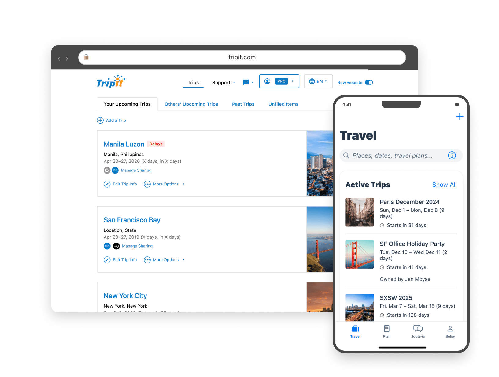
TripIt · Nine-year overview
From owning the design system to the strategy
My case studies are close-ups. Each one takes a single feature apart to show how I work a specific problem.
Information Architecture · TripIt
Diagnosing a structural problem that everyone else was solving one symptom at a time
Impact
Earned a director’s sign-off on a restructure that had spent years being dismissed as a design-team concern
Type
Initiative
Platform
Mobile + Web
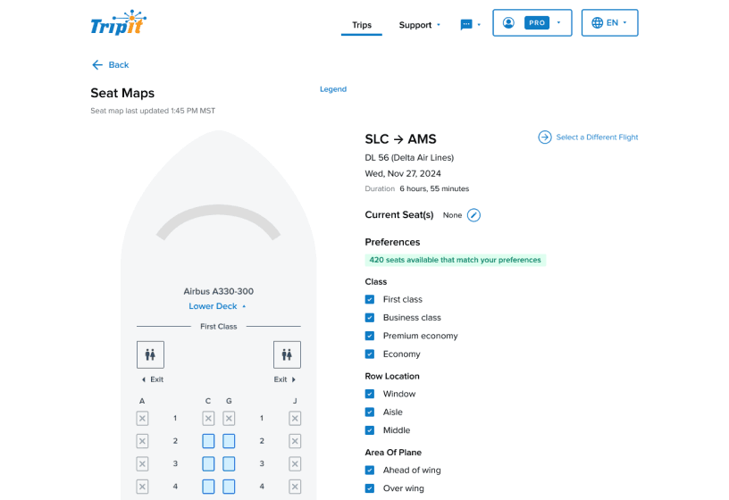
Interactive Seat Map · TripIt
A legacy alert feature that created more frustration than it solved and needed a complete rethink
Impact
Replaced reactive alert fatigue with a live visual tool travelers could act on themselves
Type
Feature overhaul
Platform
Mobile + Web
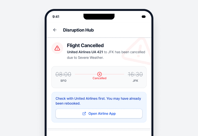
Travel Disruption Response · TripIt
Translating an executive vision into a traveler-facing MVP while navigating real API constraints and competing stakeholder priorities
Impact
A mobile MVP that aimed to give travelers immediate clarity when disruptions hit
Type
Zero to one
Platform
Mobile
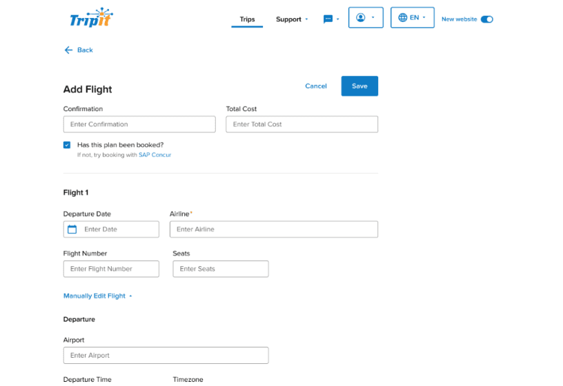
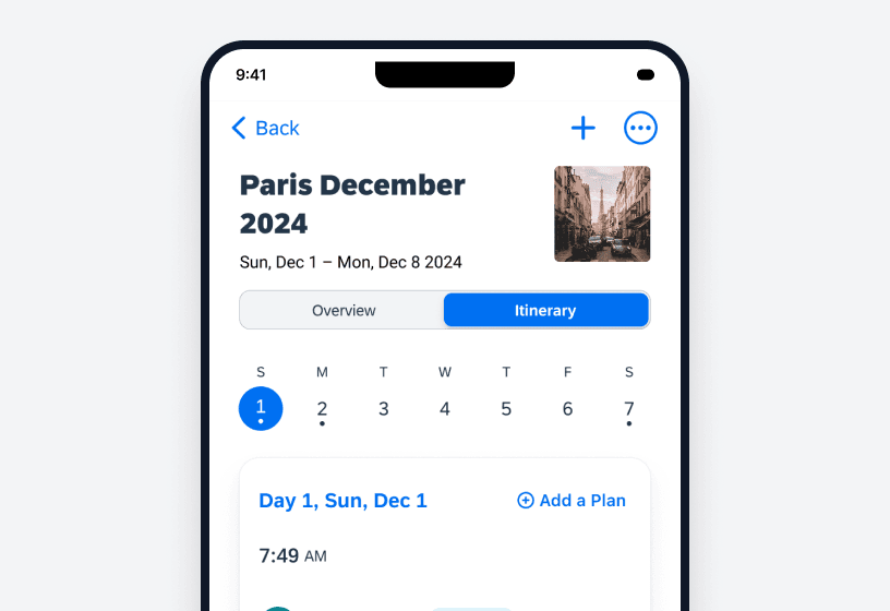
Add/Edit/View Plan · TripIt
Designing one flow that served both casual travelers and power users with deeply specialized needs without making either feel like an afterthought
Impact
One flow that served both mindsets, cutting support tickets and improving server load times
Type
Redesign
Platform
Mobile + Web
Built with the help of AI
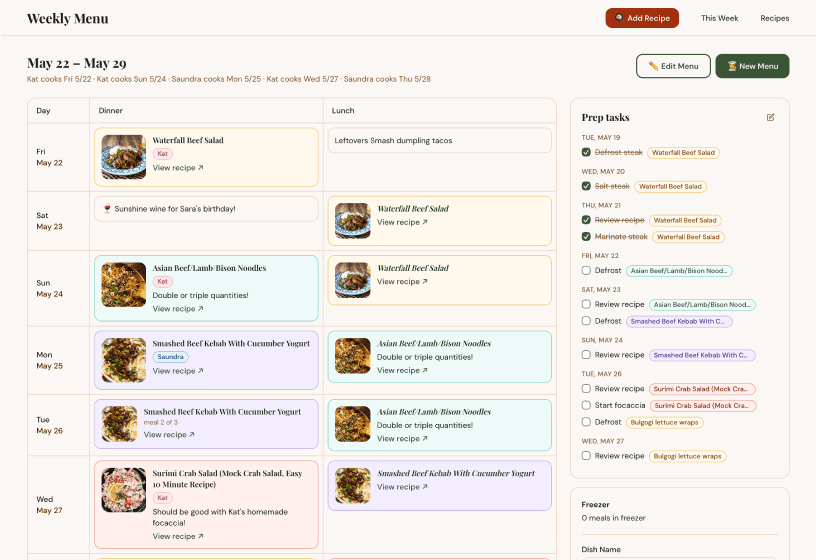
Household Menu Planning App · Personal project
Building a real household tool end-to-end with AI — and learning exactly where each tool earns its place and where human judgment still has to lead
Impact
A live, in-use app with a named design system and a repeatable AI-assisted workflow
Type
Personal project · AI-native
Platform
Responsive web
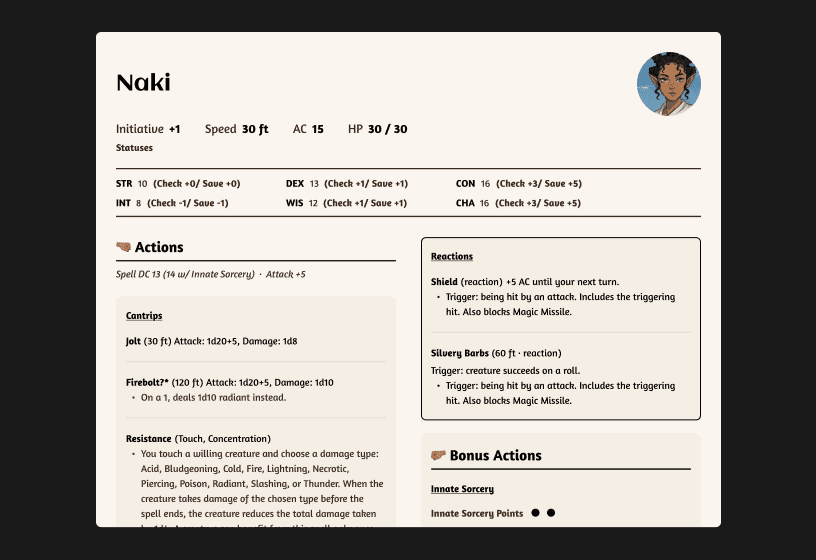
D&D Campaign Assets · Personal project
Campaign assets to make D&D more approachable
Impact
A system of scalable assets used during live play sessions to facilitate immersion and simplify the D&D system.
Type
Personal project
Platform
Figma · Tabletop
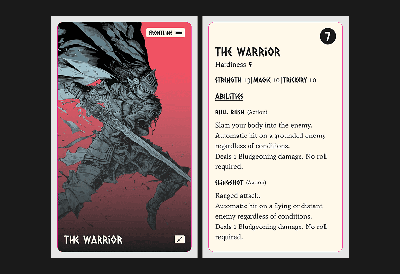
Card Game Design · Personal project
A cooperative dungeon crawler card game and the larger expandable system that forms its foundation
Impact
A systems design challenge: game elements focused on customization, replayability, and both facilitating and awarding creativity.
Type
Game design
Platform
Physical card game
Unsolicited Feedback Welcome.
If something was missing, if a case study lacked context, or if you just want to debate the merits of Baldur’s Gate 3 mechanics, I want to hear about it.