Product design
TripIt Empty States
An opportunity to solve the scaling problems, as well as update our in-app illustration style to be more in line with the brand refresh.
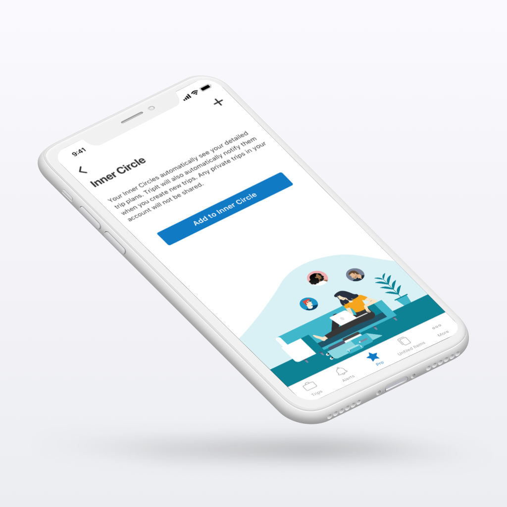
The Objective
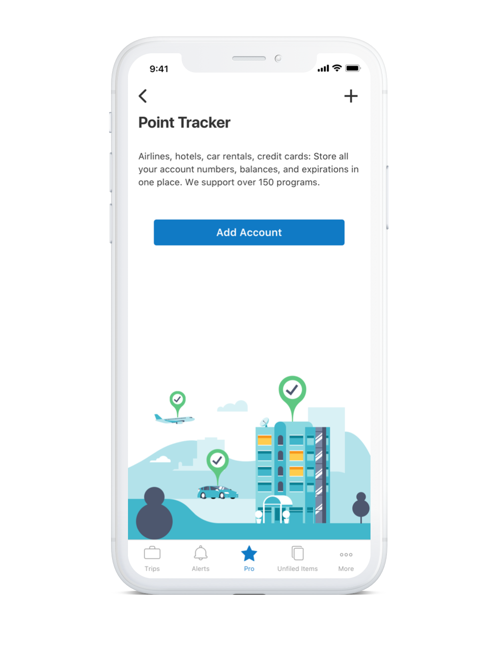
The objective was to create a new set of empty state illustrations that were visually in line with the new style that the marketing team had introduced, while ensuring that the composition of the illustrations made it easy for the developers to implement them across any screen size.
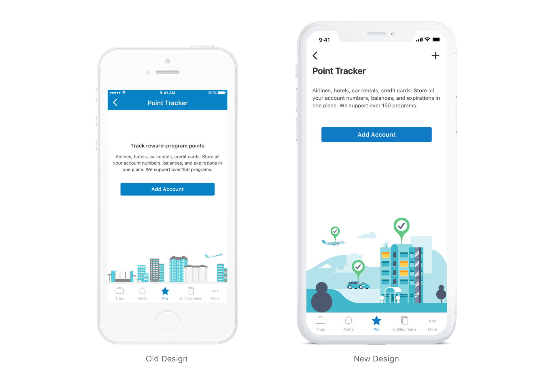
Iteration and Solution
We explored a range of options including but not limited to: 9patch image formatting, floating image composition, clever scaling… etc. In the end we decided the most simple solution was to create a series of contained images that work when appearing full-width on a smaller screen but would work just as well floating on a wider screen such as a tablet.
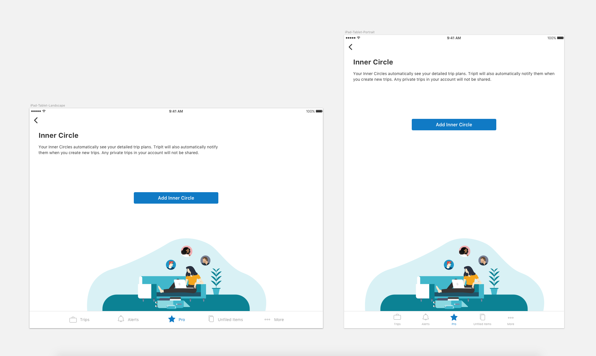
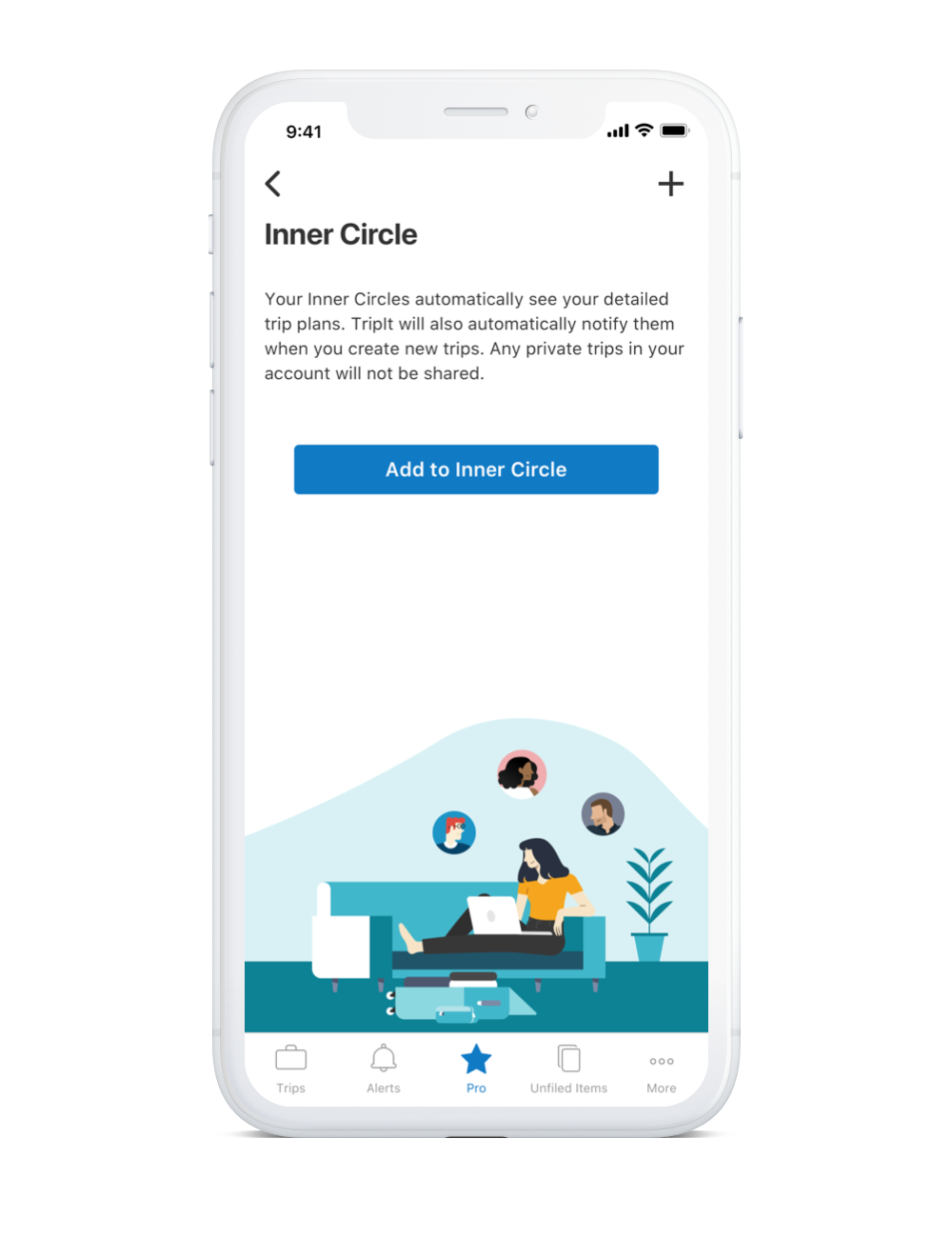
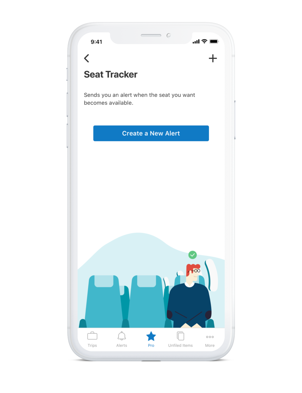
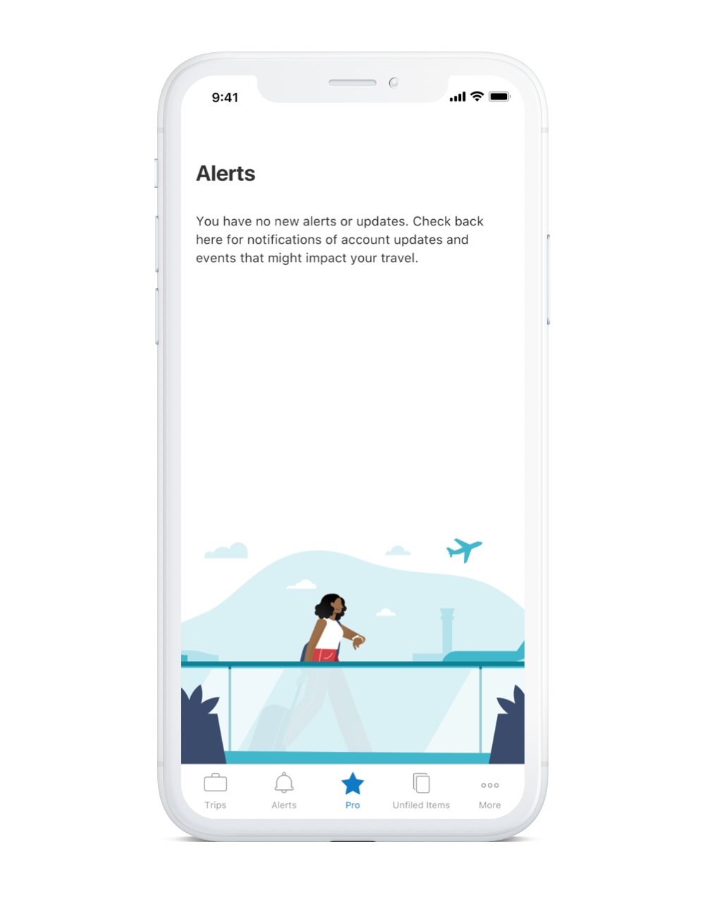
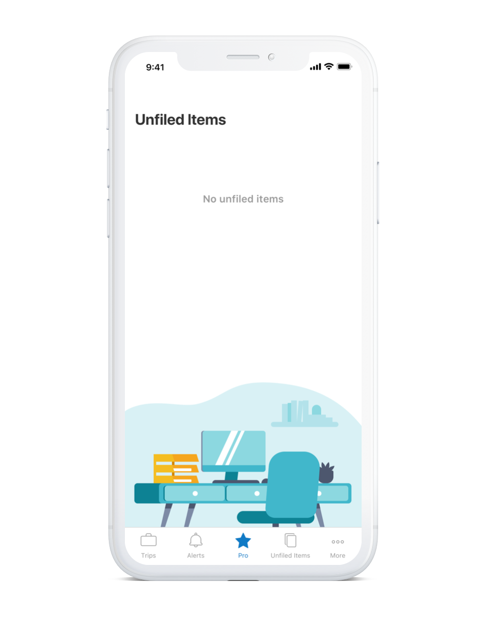
I served as project lead and worked on illustration composition using the original illustrations created by our marketing design team. If you’d like to see more awesome illustrations, do check out Liz Reddinger and Paul Skittone
