Product design

Localized Headers

Update the TripIt app headers to become more accessible, as well as improve the general user experience, update the visual design, and tackle localization concerns as well.

Defining the Problem

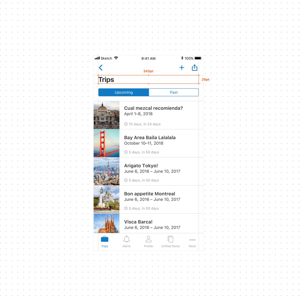
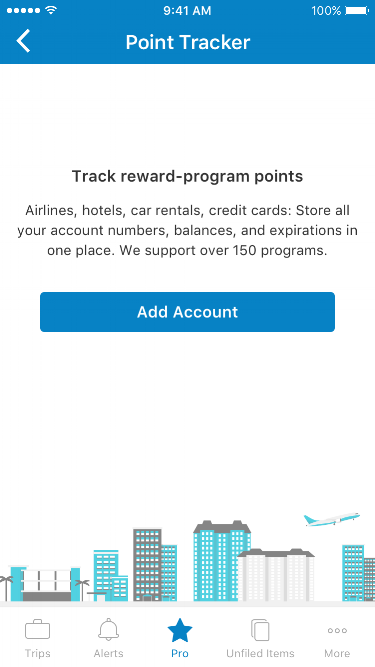
We identified 3 key issues with our current headers. (1) Both of our colored headers did not pass color contrast checks. (2) Because the titles were sandwiched between left and right UI controls, they would often get truncated. (3) Because of limited space, our subtitles were not at a readable font size.

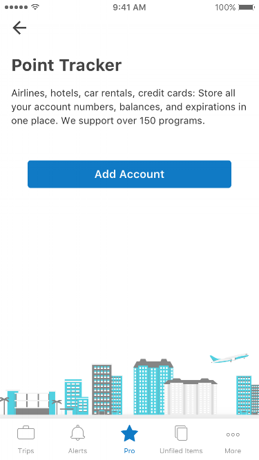
Through competitive analysis we found that a large portion of popular apps used their brand color as the header background (just as we did) and that this resulted in a large majority of apps not having headers that pass contrast checks. A common solution seemed to be the white header trend used by such apps as AirBnb, Instagram, Pinterest, Duolingo, Google Calendar… etc.

First Question

Does removing our TripIt blue from the header lower brand strength?

First Hurdle: Brand

Our first challenge in considering the white header was to come from the brand team and the possible question of whether or not removing our brand color from the header would negatively affect brand strength. White headers were primarily used by big brands such as Instagram and Pinterest, for whom brand strength would not be such a strong concern.

My solution was to take their concerns and turn them around by making it so that removing the brand color from the header would actually strengthen the brand as opposed to weakening it.

#1 Reduce our color palette in-app

We initially had 4 UI colors, not counting our status colors. We had our two brand colors, TripIt Blue and TripIt Orange, as well as an action blue to denote actionable items, as well as illustration teal that we used in coordination with the marketing team for our in-app illustrations. The goal was to remove action blue and replace it with our brand blue, therefore giving our brand blue actual function. With the brand blue out of the header, it was now free to serve as the action color.

#2 Adjust the TripIt Blue brand color to be accessible

I worked with the brand team to find a new hex code for our TripIt blue that would pass color contrast checks.

#3 Internally test results

We did some side by side testing internally and found that 100% of folks agreed that with the screen mostly left black and white by removing blue from the header, the use of blue for actionable items, ctas, and important graphical elements made our brand blue more noticeable

With the initial concern turned into a strength, we moved on to layout adjustments to address the truncation of long header titles and the unreadably small subtitle text. I took cues from AirBnb and iOS11 for the general idea to drop the title itself outside of the “notification bar” space and down to its own row. The addition of dynamic text allowance made it so that long titles, or titles in other languages had more room. This accomplished 3 main goals.

  1. Great support for localization efforts and internal concerns about verbose languages such as German
  2. A victory for universal design by allowing users with large text settings on in their devices to view TripIt the way they’d like to
  3. Making the header titles and subtitles more readable for everyone by adhering to readable text size standards

With everyone on board, the next steps were to complete an app-wide header audit and to identify one-off headers and screens that needed some UX/UI adjustments.

Certain older screens would require interaction and visual adjustments in order to adhere to a simple set of new header logic, eliminating one-off headers.

The new versions of these screens include adjusted patterns that allow us to keep to a streamlined header logic while also simplifying the UX.

Close Menu