Product design

TripIt Design System

Inspired by the debut of Google’s Material Design Guidelines, TripIt’s Design Language System is an opportunity to create a tool for TripIt that would allow the designers to spend less time sketching (using Sketch), and more time designing.

"A design system is a collection of reusable components, guided by clear standards, that can be assembled together to build any number of applications."
InVision
Design Systems

Goals

Designers

A set of consistent and clearly outlined components allows the interaction designers to spend more time thinking about the user's experience and less time fretting about pixels and colors.

Developers

Having a clearly defined system allows the developers to consolidate their coded components, cutting down on development time.

Users

A consistent system and library of components creates a cohesive experience for the user

The
Process

Interdisciplinary Workshops

We did a series of workshops with a mix of designers, engineers, product managers, as well as interested parties and stakeholders from the brand and marketing team and upper management. We led with a working session to try and identify what each group expected from a system and identified hopes and fears that each person had around the idea of working on and within a system.

Team Feedback

Next we sought to figure out how we could calm those fears by giving the designers and engineers active parts in the creation of the system. We met as a group every two weeks to discuss just how standardized the system would be, and where we could identify sections that would grow with the app. We then did some research on UI standards from iOS, Android, and Bootstrap to identify the components that we could use as a foundation for the component libraries.

Sketch

I then went out to build the library in Sketch to live as a library file that all designers could use to ensure consistency. Each component is built using nested symbols in Sketch for simplicity and efficiency. The use of a single library file helps ensure that if/when I needed to update a component, the updates would be reflected across all files for the rest of the design team.

Foundation and Themes

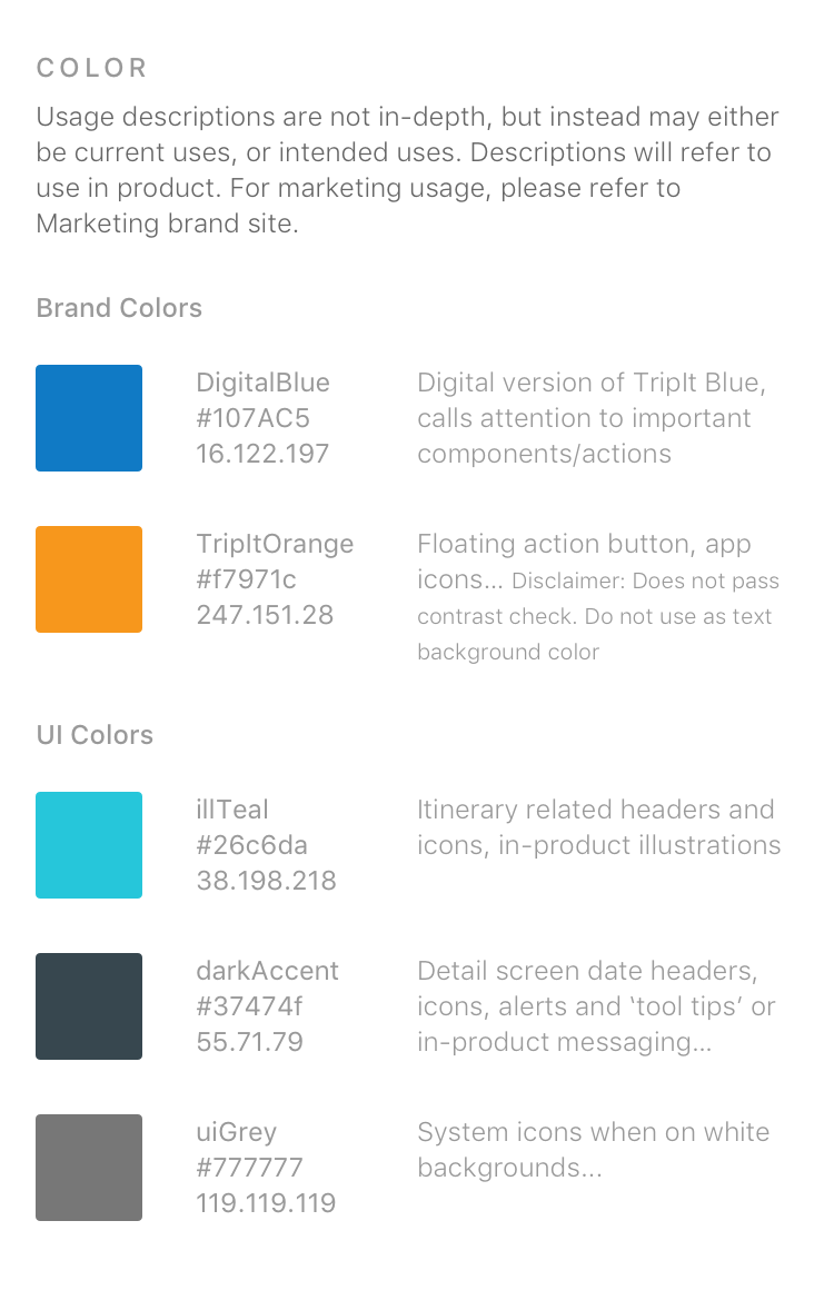
We built the foundation by taking classical brand guidelines and adapting them to digital concepts. These were color, typography, and spacing and margins.

One of the biggest victories in the initial stages of the system was carefully defining the colors to use in-app. Without a previously existing system, we discovered that colors were being picked arbitrarily by designers and engineers, thus resulting in about 100 different hex codes for both brand colors, as well as a seemingly infinite array of greys. We worked with the brand team to choose the most appropriate hex codes for our in-app versions of the brand colors, and added in detailed descriptions for when (and when not to) use each color in the palette.

Components

Next we identified the key re-usable components that appeared regularly throughout the app and reviewed user research results from feature testing to identify what was working and what wasn’t. The result was a tight selection of key components that could be customized to fit our users needs, while still remaining close to the out-of-the-box versions for each platform in order to keep our learning curve low and our users comfortable.

We defined the main use cases for our buttons and outlined the styles and states to match each. We then took this same approach and applied it to the number of other components that would form the core for our component library.


Internal usability and integration with engineers

The most important part of all of the entire process was how the system would be used and how we could integrate with our engineers, who had their own separate systems within their code bases. The system came to life in 2 different, simultaneous forms:

  1. The Sketch library file
    • This file kept all of the usable sketch symbols for each component, complete with nested symbols and overrides to make changing states easy and seamless for designers so that they could spend less time building things out in Sketch and more time focusing on iterating on their flows.

  2. The Zeplin Projects
    • Part and parcel with our introduction of the design system was the integration of Zeplin into our designer-developer relationship. We began to use Zeplin as a means to forego classical redlines, saving time for designers and making specs and assets more accessible to developers.

    • The Design Language System projects in Zeplin included the same components found in the designer library, complete with use-case scenarios and descriptions. The big difference was that through the Zeplin version of the DLS, the developers were able to easily access the exact specs for each component so they could then adjust their own code versions to ensure project specs matched the DLS, regardless of possible human error.

The DLS continues to grow and change as the TripIt app evolves. We are currently working on adding a pattern library, which would narrow the focus to identifying actual patterns and linking those patterns to components. This would improve consistency within the app and make the choice of components more meaningful and purposeful.

Close Menu