Product design
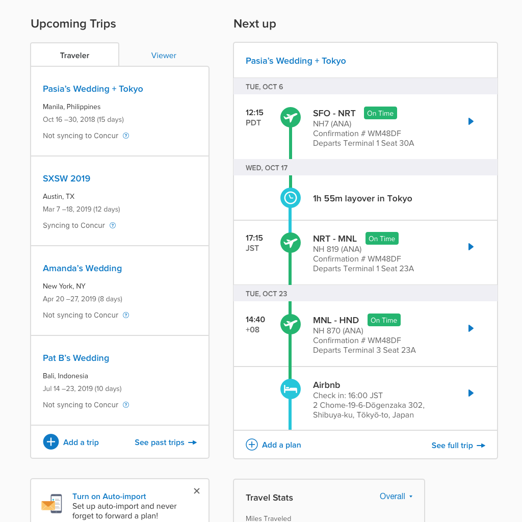
TripIt Web Explorations
A platform redesign scoped as a focused modernization effort that became something considerably harder — a compliance-driven overhaul running alongside a full feature pipeline, through four product managers, multiple engineering team changes, a complete project pause, and a non-negotiable public deadline. The legacy experience was officially sunset in early 2025.
Roles I Played
Principal UX Designer
Every design decision on tripit.com — information architecture, interaction patterns, accessibility implementation, feature design — was mine. The one exception was Travel Guidance, designed by my teammate Masayo Okamoto. Everything else on the platform: solo, running concurrently with separate feature work and other product initiatives that had nothing to do with the redesign.
Design Systems Lead
Starting from Bootstrap Vue components and an existing brand color palette, I built the design system and component library from the ground up — and maintained it throughout the entire project. This wasn't a separate workstream with dedicated time. It happened in parallel with shipping features, across a toolchain that itself evolved: from Sketch and InVision in the early phases to Figma and eventually Figma Make. The system gave incoming engineers — and there were several waves of them — a documented, reliable reference for every UI element without needing to ask why something was built a certain way.
The Problem: A Platform That Had Aged Out
Information overload with no hierarchy.
The trip detail view surfaced everything at once with no way to distinguish what mattered right now from reference data. Users described it as "page clutter of no value."
Actions buried or ambiguous.
Core tasks like editing a trip or adding a plan required multiple page loads or were hidden behind unclear icons.
No platform coherence.
Users moving between web and mobile were encountering two products that happened to share a name.
The Challenge: Designing Through the Chaos
A rotating door of product partners
The project ran through four PMs over its lifespan. The original PM was brought in specifically for this initiative and left after roughly two years. Her replacement was pulled to another team within months. I was also pulled off for approximately a year to work on a separate product, TripLink, before the project restarted. Each re-entry meant onboarding new partners with no prior context on decisions made years earlier.
A deadline that wasn't moveable
When the redesign became a hard priority again in early 2024 — driven by a particularly high-profile contract with strict compliance requirements — the timeline was tied to SAP Concur's Fusion 2025 conference. That date didn't move. The team working toward it included a distributed engineering group spanning the US and Brazil, many of whom were new to the codebase and the product.
Continuity as a design skill
Across every team change, tool migration, and project restart, I was the only person who had been present for the full arc. The design system I had been building the whole time wasn't just a component library — it was the institutional memory of the project. Every decision that had ever been made lived somewhere in that file. Keeping it coherent and current while simultaneously shipping under a feature factory timeline was, in retrospect, as much a part of the job as the design itself.
The Approach: Phased Parity, Then Sunset
The goal was full feature parity with the legacy experience — users could not lose access to anything they had before — while modernizing interaction patterns, establishing visual consistency, and satisfying compliance requirements.
We launched in phases with a toggle that let users switch between new and legacy while the new experience was built out. This reduced risk during the transition and gave us room to address edge cases without blocking progress. Usage of the legacy toggle declined steadily as the new experience matured. It was removed on schedule in early 2025.
What the redesign addressed:
- Full IA overhaul of the three primary surfaces: signed-in homepage, trip list, and trip detail view
- Cross-platform consistency — porting mobile patterns like the timeline view to web, where they had tested well with users
- Accessibility throughout: skip navigation, WCAG-compliant contrast, and dynamic text sizing support
- Compliance updates required by the high-profile contract and EU market expansion
- Design system built from scratch and maintained across the full project lifespan
The Outcomes
The full experience launched in early 2025, which means meaningful longitudinal data is still relatively recent. What we do have: the legacy toggle saw consistent decline in usage post-launch and was retired on schedule, suggesting users were finding what they needed in the new experience without needing to fall back.
The more established signal came from our Customer Support team, whom we collaborated with regularly throughout the project to triage user-reported friction. That feedback loop directly shaped efforts like the Add/Edit/View Plan update — a post-launch iteration driven entirely by support ticket patterns. A noticeable drop in tickets related to the specific pain points we targeted was the clearest indicator we had that the redesign was doing what it was supposed to do.
What I'd Do Differently
- Fight for more research. The early research was solid and shaped the initial direction well. In the middle years, under PM turnover and deadline pressure, the process leaned more heavily on support signals and design judgment than structured user input. It held up — but it was a calculated risk, not a deliberate choice.
- A better system for rich UX documentation. The design system carried a lot of institutional memory, but decisions that lived only in my head created unnecessary risk every time a new team member joined. A lighter-weight decision log running alongside the Figma file would have made every onboarding faster.