Research: Video Diaries
A collection of 6 travelers used the think-aloud method to show why they go to the web versus mobile and what they expect for a web experience. Users commented on what they’re doing, during what phase of the trip, what works/doesn’t work, and if they can find the actions for what they came to do.
Task: Add and Edit Trip
Users could not find the CTA to edit the trip wrapper because it was hidden within an unclear icon menu (the gear). Users could not quickly add plans to their trip because the CTA got lost due to lack of visual hierarchy to guide attention. The terminology around "trip" was unclear.
Task: Reviewing Plans
Participants could not easily scroll to get to certain plans by day for long trips.
Task: Add and Edit Plan
Participants had more fields than what they currently had information for and intended to input in one sitting. It was also difficult to decipher which actions were for the trip at large, or for the specific plan.


A few select tidbits of feedback
We experimented with out-of-the-box Bootstrap web components to see what we could get with the minimum amount of development time. This proved very possible but only for the signed-in homepage as the following pages proved they needed more than a visual makeover.
Quick mocks were put together to show a version of the Trip Show page integrating the mobile timeline and an additional user-research session was done using the task-based testing methodology.
Signed-in Homepage
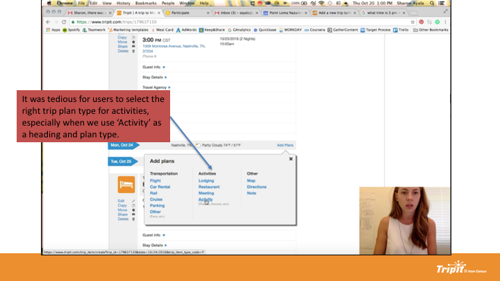
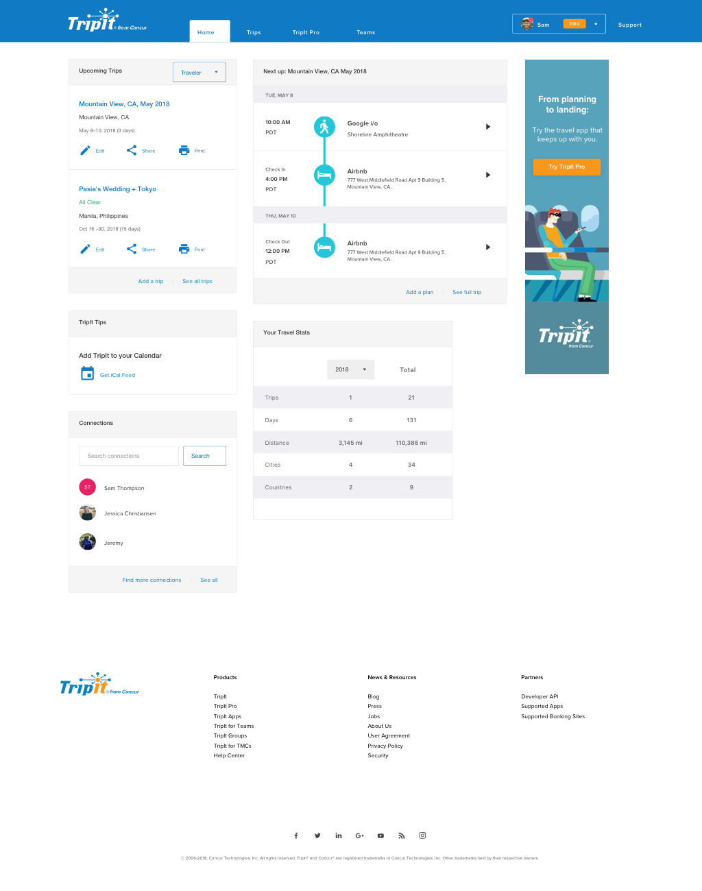
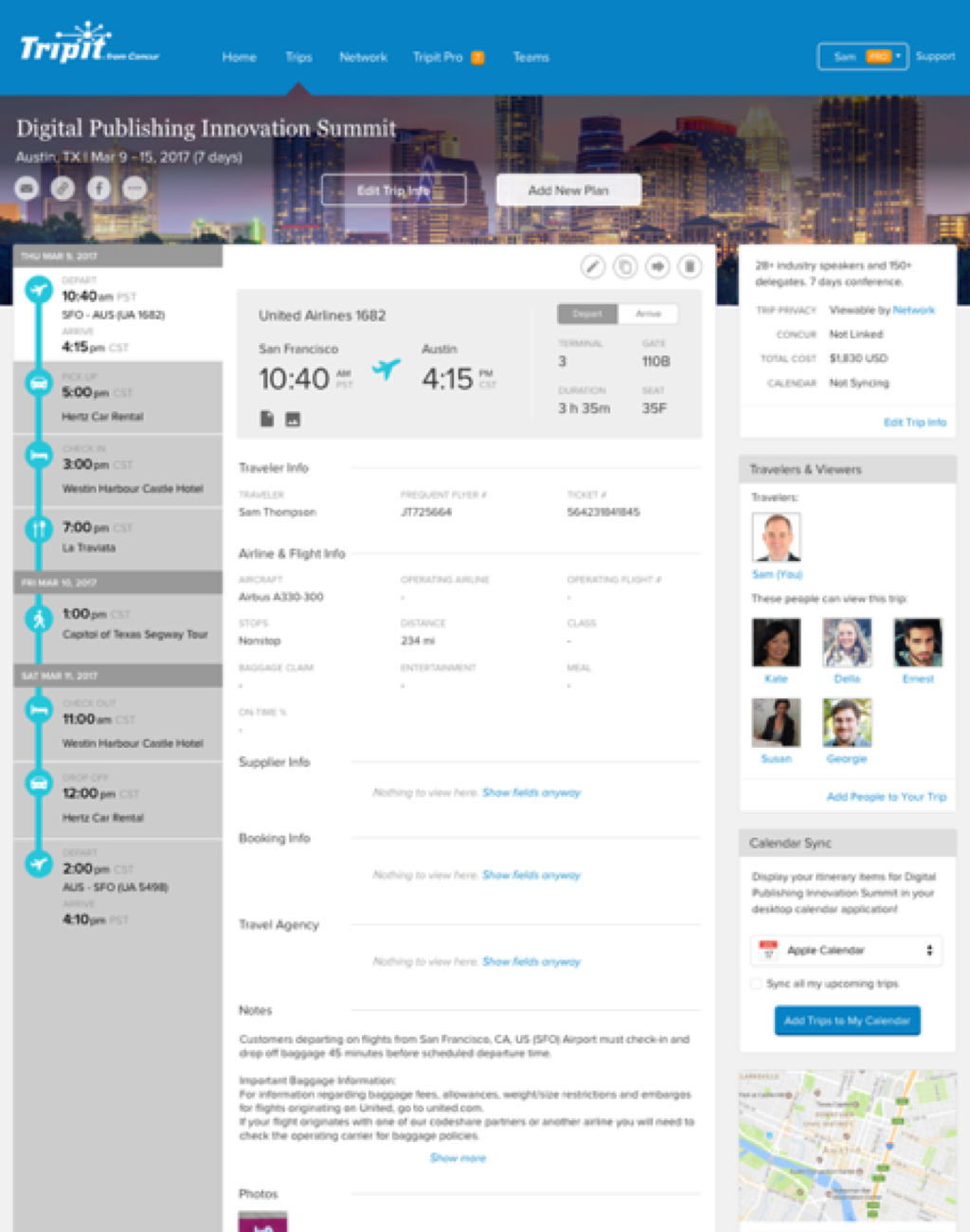
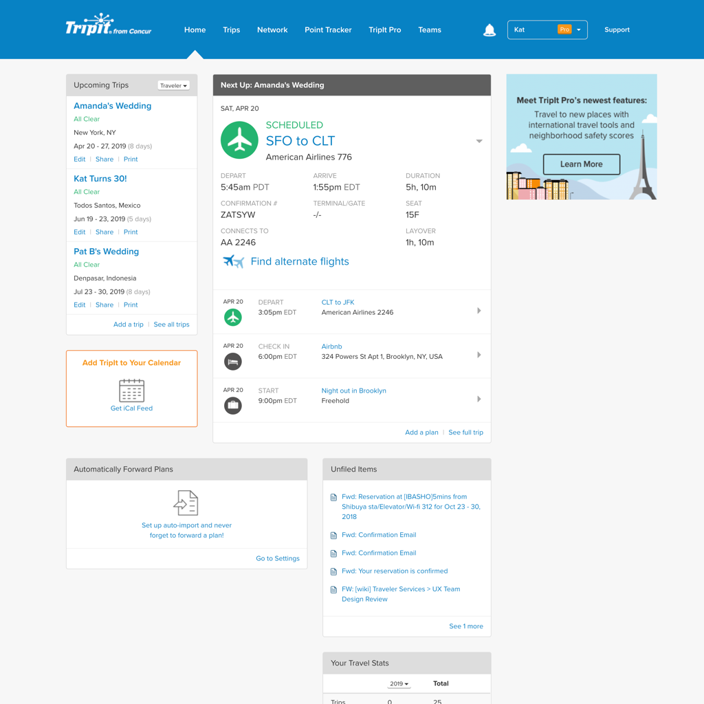
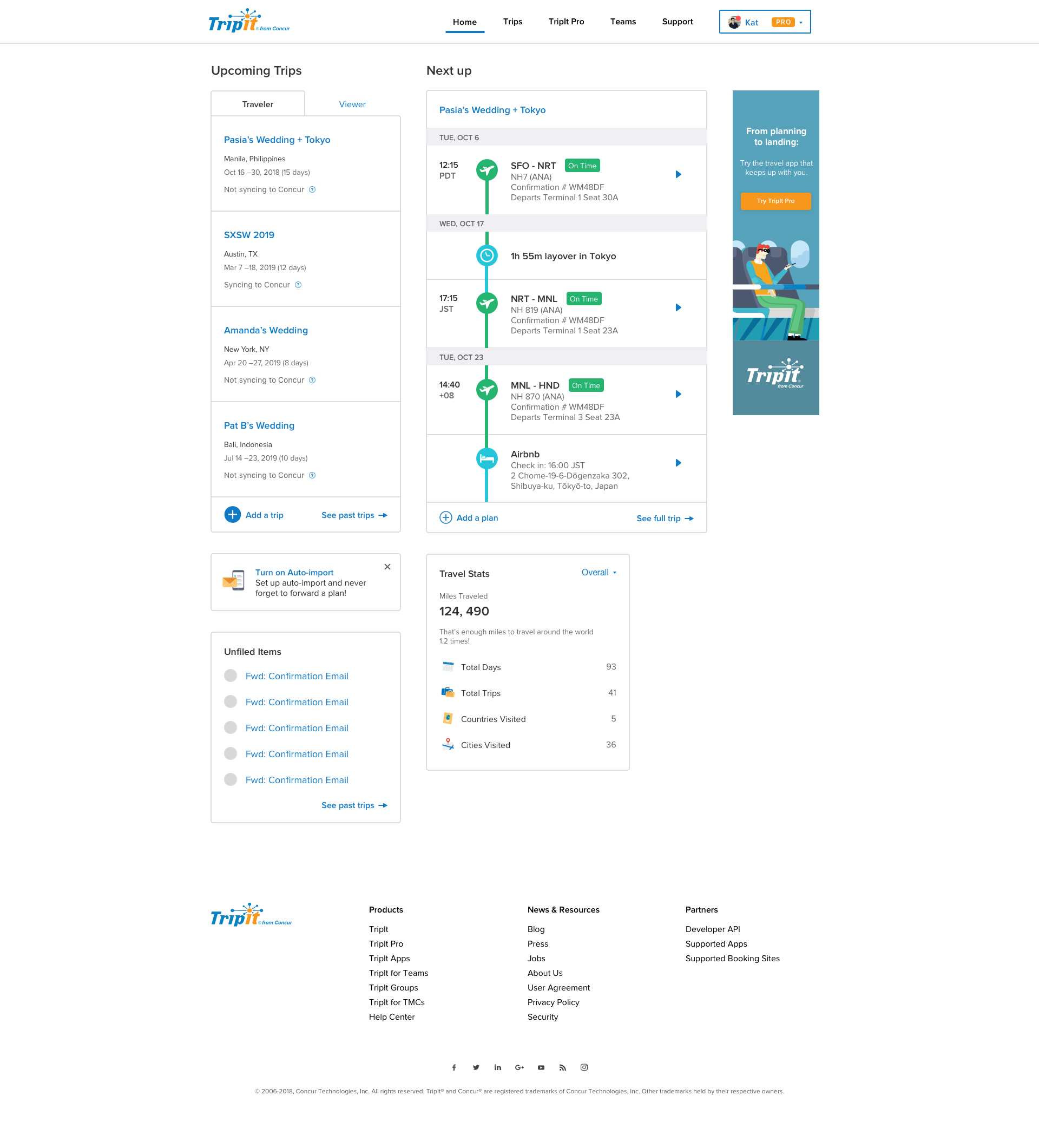
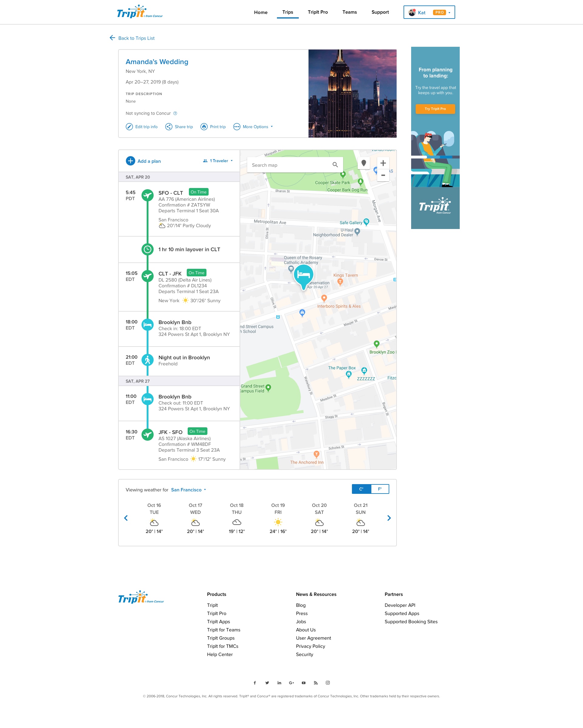
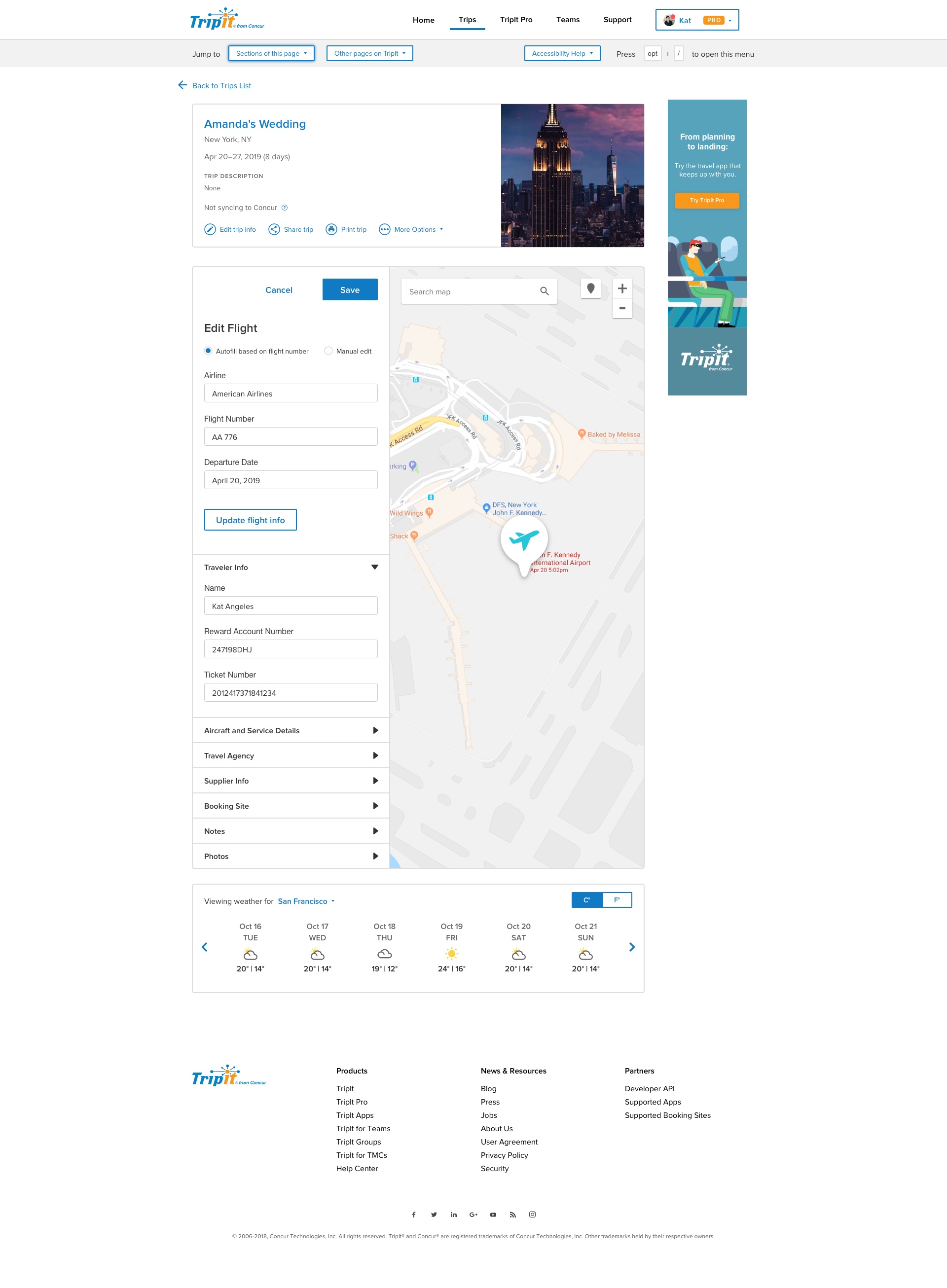
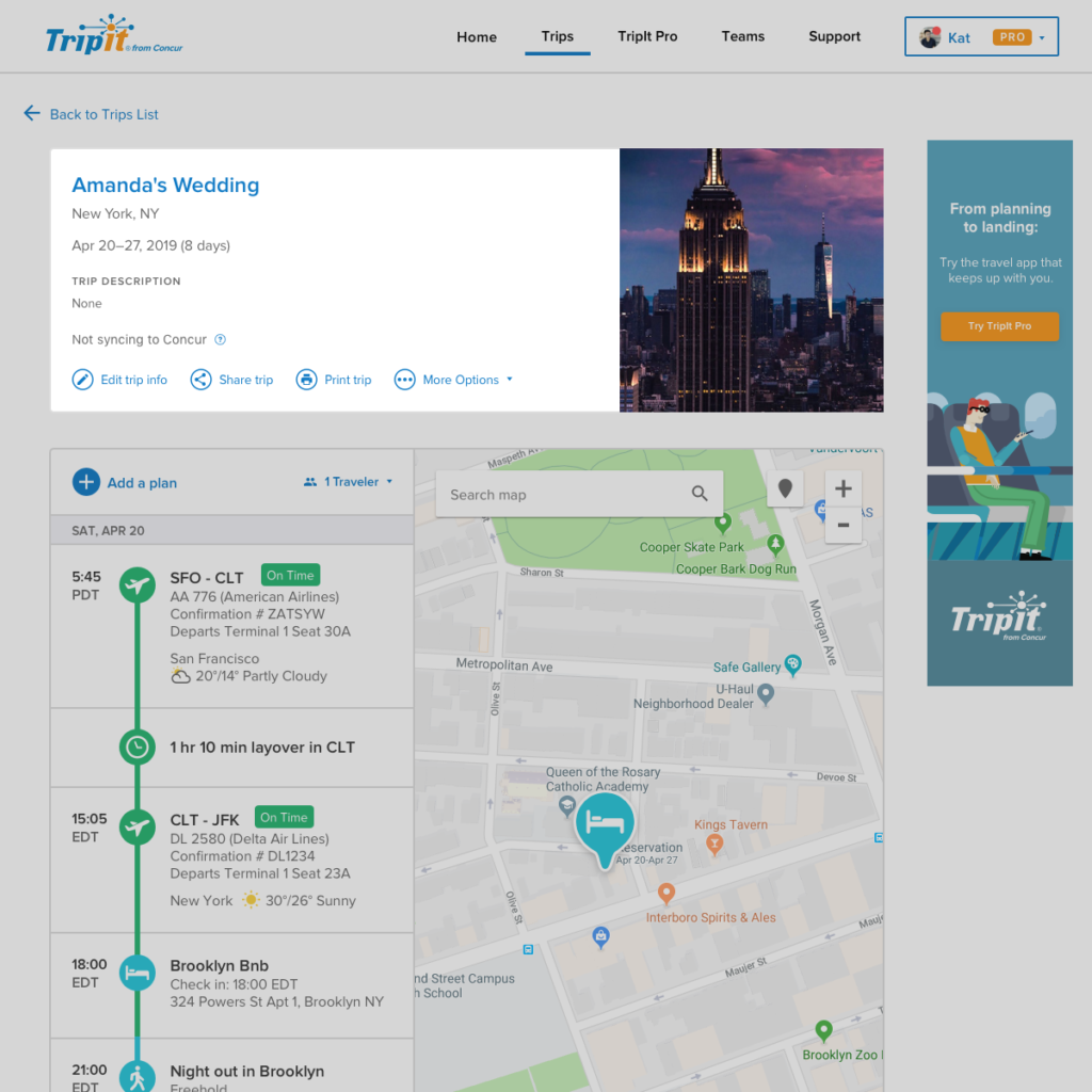
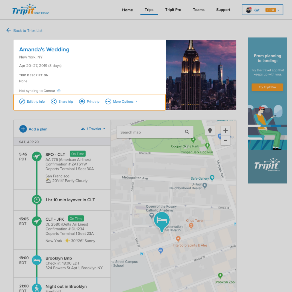
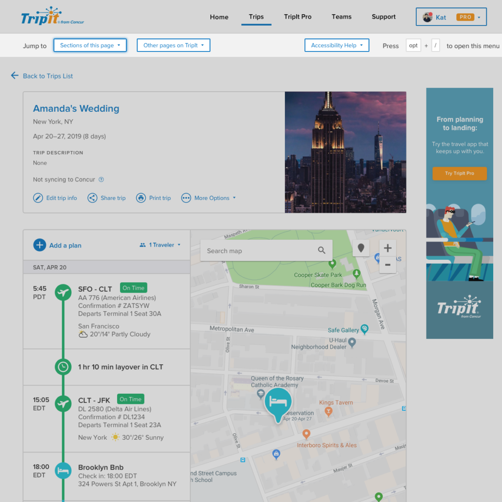
Being the most recently updated page, this was mostly a UI facelift, making color changes and incorporating iconography to create a more consistent feel with the mobile app.
* Introduced “?” (more info) icon to allow for short blurbs that can explain some TripIt terminology (e.g. Syncing to Concur)


Trip List
- Created an expanded version of the trip cell from the previous page that we’re calling the “Trip Container” which will be a consistent element that may adjust slightly to context but will otherwise be consistent.
- Contained trip-level actions within the Trip Container to make action and content relations crystal clear
- Adjusted grouping of elements to place related components closer together
- e.g. the page counter and page view control
- Streamlined tab navigation to be fully trip-related
- Adjusted tab, filter, and button UI to make active and inactive states clearer


Trip Show Breakdown
Used Trip Container to make trip-level info and plan-level info clearer
Made actions more descriptive to lessen ambiguity
Incorporated timeline view from Mobile to create more consistency between platforms. The timeline has also consistently tested well as a visual representation of a traveler’s journey
Added “Skip nav” control for users of assistive technology such as JAWS
Made weather feature more contextual to raise value
Added weather widget to allow users to easily find more specific weather info if desired


