Data-Driven Decision Making (2026)
Streamlining Plan Creation: Balancing Power Users and Simplicity
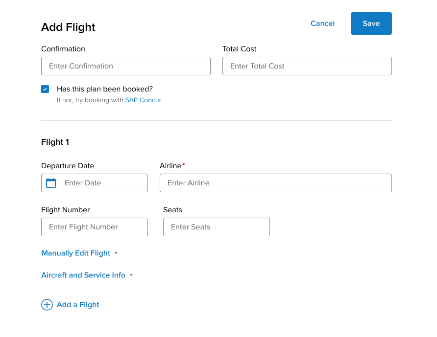
The Challenge: Following a major web redesign, our highly detailed power users (the “Groomers”) experienced severe friction, reporting that adding niche trip details now required excessive clicks and multiple slow page loads. The challenge was restoring immediate access to these deep details for our power users without cluttering the UI for casual travelers who just wanted to quickly save a flight and move on.
The Action: As Principal UX Designer, I solved this by redesigning the flow using progressive disclosure. I surfaced core inputs at the top of the screen for casual users, while collapsing the dense “Secondary Details” into easily accessible accordions at the bottom. This transformed a frustrating multi-page maze into a clean, unified, single-page architecture.
The Impact: This hybrid approach successfully balanced the needs of both user mindsets while allowing engineering to consolidate multiple backend calls into a single save action, drastically reducing server load times. The update resulted in a tangibly faster UI and a noticeable drop in Customer Support tickets regarding missing details and excessive clicks.
Feature Enhancement (2025-2026)
Seat Maps: From Black Box Alerts to Visual Autonomy
The Challenge: TripIt’s legacy “Seat Tracker” was a deeply frustrating “black box” alert system. It bombarded users with push notifications when a preferred seat opened up, but due to inherent booking latency, those seats were almost always gone by the time the user called the airline to claim them. It created alert fatigue and left travelers feeling powerless.
The Action: As Principal UX Designer, I solved this by redesigning the flow using progressive disclosure. I surfaced core inputs at the top of the screen for casual users, while collapsing the dense “Secondary Details” into easily accessible accordions at the bottom. This transformed a frustrating multi-page maze into a clean, unified, single-page architecture.
The Impact: This hybrid approach successfully balanced the needs of both user mindsets while allowing engineering to consolidate multiple backend calls into a single save action, drastically reducing server load times. The update resulted in a tangibly faster UI and a noticeable drop in Customer Support tickets regarding missing details and excessive clicks.
SOLO-LED MAJOR REDESIGN (2022)
TripIt Web Redesign Phase 1
The Challenge: TripIt’s legacy web experience lagged behind its mobile counterpart and lacked the necessary legal compliance to expand effectively into the European market.
The Action: As the solo UX practitioner, I led a 12-month, end-to-end redesign of the entire web application. This involved porting mobile-exclusive capabilities to achieve cross-platform feature parity, overhauling the information architecture of multi-layered itinerary data to make dense trip plans scannable, and establishing continuous feedback loops with Customer Support to iterate and bridge legacy gaps.
The Impact: Successfully launched an EU-compliant web experience that unlocked a major international market, directly driving a 17% increase in new user sign-ups while drastically improving overall platform performance.
FIRST PROJECT AS LEAD DESIGNER (2019)
TripIt Map View
The Challenge: TripIt users could view their itineraries chronologically, but had no way to visualize them spatially. Frequent business travelers needed a way to coordinate how they would get around unfamiliar destinations and see how their plans related to each other on a map.
The Action: I led the product design for a new map feature, utilizing participatory user research to narrow down the core needs: understanding spatial relations, finding their current location, and accessing transportation. I designed the MVP Map View, implementing clear icon states and swipe-able cards that dynamically drive the map’s focus.
The Impact: The Map View MVP successfully drove massive user engagement. Within one month of launch, feature usage hit 25%, significantly outperforming the 10% average engagement rate typical of most other TripIt features.
PERSONAL WORK THAT MAKES ME SMILE
D&D Stat Blocks
The Challenge: As a Game Master running an Obojima campaign for brand-new players, I needed to maintain immersion while avoiding the cognitive overload of traditional rulebooks. Because players were learning fundamental concepts like “hit points” from scratch, the complex game data needed to be dramatically simplified and tailored.
The Action: I utilized systems thinking to design custom, highly visual character cards. By consolidating data from multiple sources and employing progressive disclosure, I tailored the UI to each specific class—surfacing mechanics like “Concentration” or “Hide” only where contextually relevant to reduce the learning curve.
The Impact: The custom UI drastically streamlined gameplay, allowing players to find contextual mechanics instantly without breaking immersion. Operating as a living product, the cards continuously evolve based on user feedback, shedding “training wheel” text as players master mechanics to free up valuable visual space.
