Seat Maps: From Black Box Alerts to Visual Autonomy

TripIt’s legacy “Seat Tracker” feature was designed to solve a universal travel anxiety: getting stuck in a bad seat. However, the execution was fundamentally flawed. It operated as a “black box” alert system that bombarded users with frustrating notifications for seats that were almost always gone by the time they called the airline. For the major TripIt Web redesign, I led the strategic pivot to transform this broken alert system into “Seat Maps”—a dynamic, interactive visual experience that gave power and autonomy back to the user, successfully launching on Web before achieving cross-platform parity on native mobile.

My Role: Principal UX Designer​

Led the end-to-end UX/UI strategy for the new Seat Maps experience across both Web and Mobile. Partnered deeply with engineering to integrate a new data provider (Sabreator) and architected the complex filtering and interaction models.

The Problem: The "Middleman" Frustration

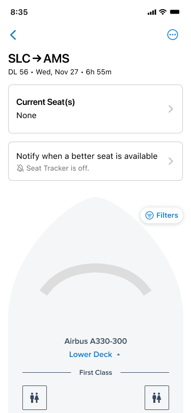
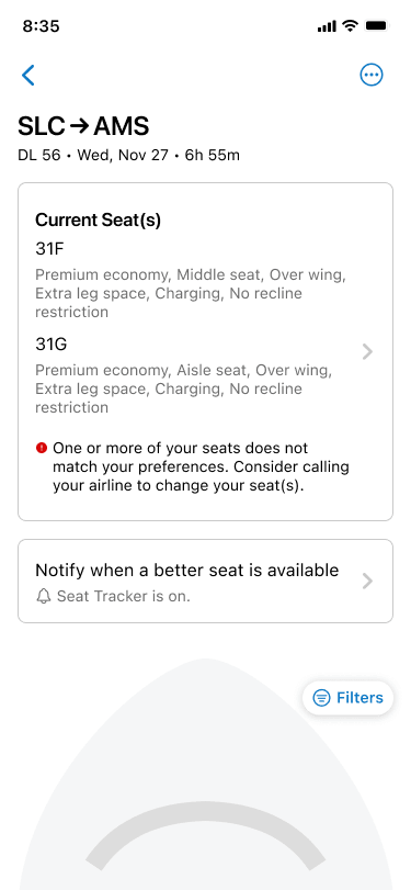
The old Seat Tracker was technically functioning, but experientially broken. A user would input their desired seat preferences (e.g., “Aisle, Economy”) and TripIt would aggressively ping them every hour if a match was found.

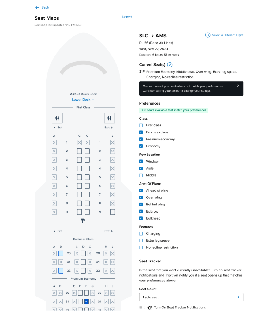
The problem was latency and a lack of transparency. By the time TripIt found the seat, sent the push notification, and the user called the airline to claim it, the seat was almost inevitably taken by someone else.

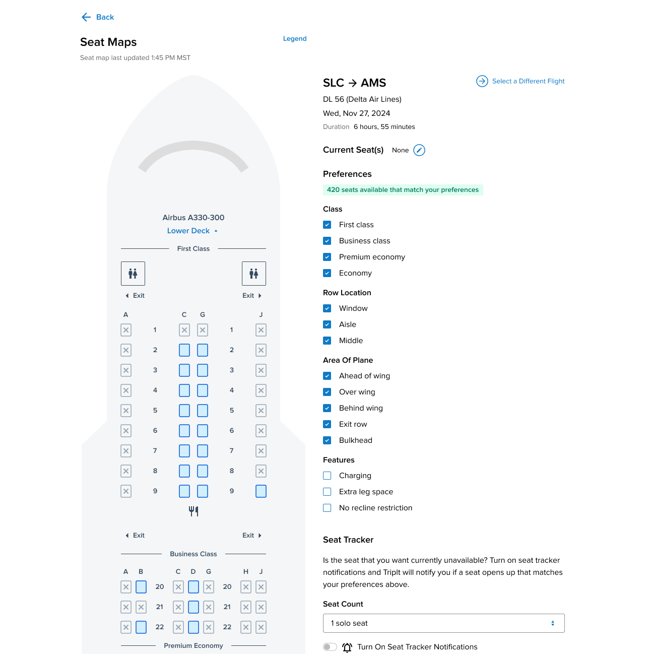
I described the old UX to my team as being like trying to order lunch for the office, but only one person has the delivery app on their phone. You tell them what you want, they punch it in, wait for the app to tell them it’s sold out, ask you for a backup choice, and the cycle repeats. It is a slow, blind, and deeply frustrating experience. Travelers don’t want to blindly request a seat and hope for the best; they want to see the whole plane and choose for themselves.

The Strategy: Visual Autonomy & Data Integration

We needed to move from a reactive alert model to a proactive, visual model. Working closely with my engineering partners (Sofia and Rich), we determined that by integrating a new internal microservice connecting to the Sabre reservation system, we could pull live, dynamic seat data.

Instead of hiding this data behind an alert trigger, I designed a full-screen, interactive aircraft map.

  • The Visual Pivot: Users could now open Seat Maps and instantly see exactly which seats were occupied, available, or premium.

  • Dynamic Filtering: I designed a robust filtering system allowing users to instantly highlight seats based on Class, Row Location, or specific features (like “Extra leg space” or “No recline restriction”).

  • The Hybrid Solution: Because we didn’t want to remove a legacy “Pro” feature, we didn’t kill the alert system entirely. Instead, we folded it into the new visual experience. If a user looked at the live map and saw their perfect seat was taken, they could seamlessly toggle the Seat Tracker on right from that screen, using their applied filters as the alert criteria.

The Challenge: Cross-Platform Complexity & Accessibility

After successfully launching the dense, data-rich map on the Web, the mandate was to bring the feature to native iOS and Android to close the parity gap.

Shrinking a massive, multi-deck aircraft schematic onto a mobile screen while maintaining WCAG accessibility standards was a massive architectural challenge. The aircraft layouts were highly variable, and the filtering logic was deep.

To solve this, I designed a stackable, modal-sheet architecture for mobile. Rather than forcing the user to constantly pinch, zoom, and lose their place on the map, the live aircraft graphic remained the anchor. Interaction points (like tapping a specific seat or opening the filter menu) triggered clean, bottom-up sheets that preserved the user’s context while easily accommodating device-specific settings like dynamic text sizing and dark mode rendering.

Outcomes & Measurement Strategy

The launch of Seat Maps successfully sunset a highly frustrating, noisy legacy feature and replaced it with a modern, empowering user experience that brought TripIt up to par with native airline apps. It was a massive win for cross-functional collaboration, with engineering successfully untangling years of legacy alert logic to support the new visual UI.

Because this was an experimental pivot aimed at rescuing a low-engagement feature, our measurement strategy going forward was designed to track intentionality:

  • Feature Engagement (Map vs. Alert): Instrumenting the front-end to track the ratio of users who simply viewed the map and self-resolved their seat anxiety, versus the users who actually engaged the legacy Seat Tracker toggle.

  • Filter Utilization: Tracking which specific filters (e.g., “Charging” vs. “Bulkhead”) saw the highest usage, providing our product team with direct, quantitative data on what amenities our business travelers value most.

Close Menu