Streamlining Plan Creation: Balancing Power Users and Simplicity
Following the major rollout of the new TripIt web experience in April 2025, Customer Support tickets highlighted a friction point: our highly detailed power users (affectionately known as “Groomers”) felt the new flow was slower and required too many clicks to add niche trip details compared to the classic site. We needed to restore easy access to these deep details for our power users, without cluttering the UI for our casual travelers who just want to quickly save a flight and move on.
My Role: Principal UX Designer
Led the end-to-end design, working closely with Product and a distributed Engineering team (US and Brazil). I drove the product discovery, established the new UI patterns, and delivered developer-ready specifications through a heavily documented Figma design system.
The Problem: The "Groomer" vs. Casual Mindset
Through our qualitative feedback, we identified a massive split in how users approached the Web app versus the Mobile app. On mobile, users are in a “glance” mindset. On the web, they are in a “data entry” mindset.
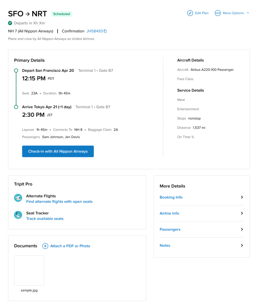
Our “Groomers” are a small but incredibly valuable subset of users who drive long-term retention and referrals. They painstakingly log every confirmation number, dietary note, and policy detail. However, the new web architecture had buried these “Secondary Details” on an entirely separate page. For a Groomer, adding a simple trip note suddenly required 4 to 5 clicks and multiple page loads. It was exhausting.
Create vs. Edit friction
Users had to save a new plan before entering core details like notes/travelers/documents; performance concerns amplified the pain.
Trip context missing on web
Trip Description (present on iOS) was removed on the web, breaking workflows for storing policy numbers, booking references, and overall trip notes.
Information density & speed
Users wanted all critical info on one page with fewer clicks; print views and timeline surfaced additional pain points.
The Solution: Progressive Disclosure & Performance
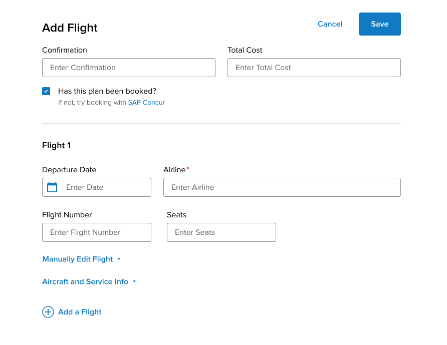
We couldn’t just dump 20 input fields onto the main screen—that would overwhelm the 90% of casual users who only need to input a date and a destination.
The UI Strategy (Progressive Disclosure): I redesigned the Add/Edit Plan page to feature only the core, critical inputs at the top. I then took the dense “Secondary Details,” collapsed them into clean accordion modules, and placed them at the bottom of the page.
The “Dual-Save” Safety Net: To ensure casual users weren’t burdened by the long page, I implemented “Save” buttons at both the top and bottom of the screen. A casual user could fill out the top three fields and hit Save without ever needing to scroll down, while a Groomer had immediate, single-page access to every niche field they needed.
The Engineering Win (Single-Page Architecture): By consolidating these separate pages into one unified view, our engineering team was able to completely change how the app talked to the database. Instead of making multiple backend server calls every time a user navigated to a new detail section, the app now made one single backend call upon saving. This drastically reduced loading times and created a tangibly faster experience.
Process and Collaboration
Working with a distributed engineering team across the US and Brazil meant communication had to be bulletproof. I didn’t just hand off static screens; I maintained a highly organized Figma environment harnessing both the static spec screens as well as prototypes to help communicate interactions. I clearly separated “Work in Progress” from “Ready for Dev,” heavily used comment threads to document why certain UX decisions were made, and relied on and updated our established Design System components (colors, spacing, sizing) so the developers could build the UI rapidly and without guesswork.
Outcomes & Strategic Measurement
The immediate outcome was a highly successful, performance-friendly UI that directly resolved the friction highlighted in our Customer Support tickets.
Because we were operating with a lean analytics infrastructure at the time, our primary metric for success was qualitative: a noticeable drop in Jira tickets related to “too many clicks” and “missing trip descriptions.” alongside the performance improvements.
Efficiency
Fewer clicks and less page switching during create/edit; improved time-to-complete for common plan types.
Data completeness
Higher fill-rates for Notes, Traveler(s), Documents, Total Cost at creation.
Satisfaction
Reduction in feedback items tagged “too many clicks,” “notes missing,” “trip description missing,” and “can’t see info in one page.”
Looking Forward
If I were to launch this feature today with a modern product analytics stack (like Amplitude or Mixpanel), my measurement strategy would look like this:
Task Completion Rate & Time-on-Task: Track the time from the moment the user clicks “Add Plan” to the moment they hit “Save,” ensuring the new single-page architecture tangibly reduced the seconds spent on data entry.
Module Engagement: Instrument the front-end to track clicks on the collapsed “Secondary Details” accordions. This would allow us to definitively prove what percentage of our daily active web users are acting as “Groomers,” informing how much future engineering resources we should dedicate to power-user features.