Product design
TripIt Map View
Design a map feature that would help users coordinate their plans pre-trip and during the trip, and help them navigate potentially unfamiliar destinations.
Researcher: Nate Dumas
UX Fellow: Rachel Lin
Product Design: Kat Angeles
Defining the Problem
Currently, users have the ability to see how their plans relate to each other in terms of chronology but not spatially. There is an opportunity to provide an alternative view to Trip Summary’s timeline view, but the real question turned out to be: “How might we relieve anxiety for frequent business travelers like Sam and Hannah who need to coordinate how they will get around within potentially unfamiliar destinations?”
The next question was then: “What would a user even want out of a map view?”
User Research
Participatory Design
Users were given a scenario of finding out where their plans were in a business trip once they landed and were asked to perform tasks during 1 hour sessions. Tasks included (but were not limited to) discovering the map feature, navigating betweel plans, navigating back to the timeline view, accessing Navigator… etc.
What is a Useful Trip-Level Map Experience?
- Scope: Single and multi-day trips for single travelers to a single destination, particularly in domestic destinations they are unfamiliar with
- Maps should be contextual based on where travelers are in the trip (pre-trip versus in-trip), with pre-trip showing all plans and where they are in relation to each other.
- While in-trip, highlighting current location is most useful, especially when only basic plans are imported into TripIt and the blue dot stands in for plans users have not imported.
- Seeing nearby landmarks and other businesses in relation to their plans is useful, (i.e., traveler has free time or urgent needs.)
User Research
The Importance of Time
There was a split on the usefulness of showing the timeline and having it drive the map.
It was useful for some for interpreting map content and they saw the timeline as a legend.
What was more important for the other portion of users was where things were located in relation to each other at the start and end of each day, not necessarily where they fall in the timeline.
Not wanting the map view to compete with the timeline view (though a hybrid version is something to be considered,) we decided to focus the map view on spatial relations while leaving chronological relationships to the timeline view.


Favorite User Comment:
No offense but I probably wouldn’t open TripIt with the intention of getting directions to my next destination. I’d most likely open Google Maps.”
Identifying Scope
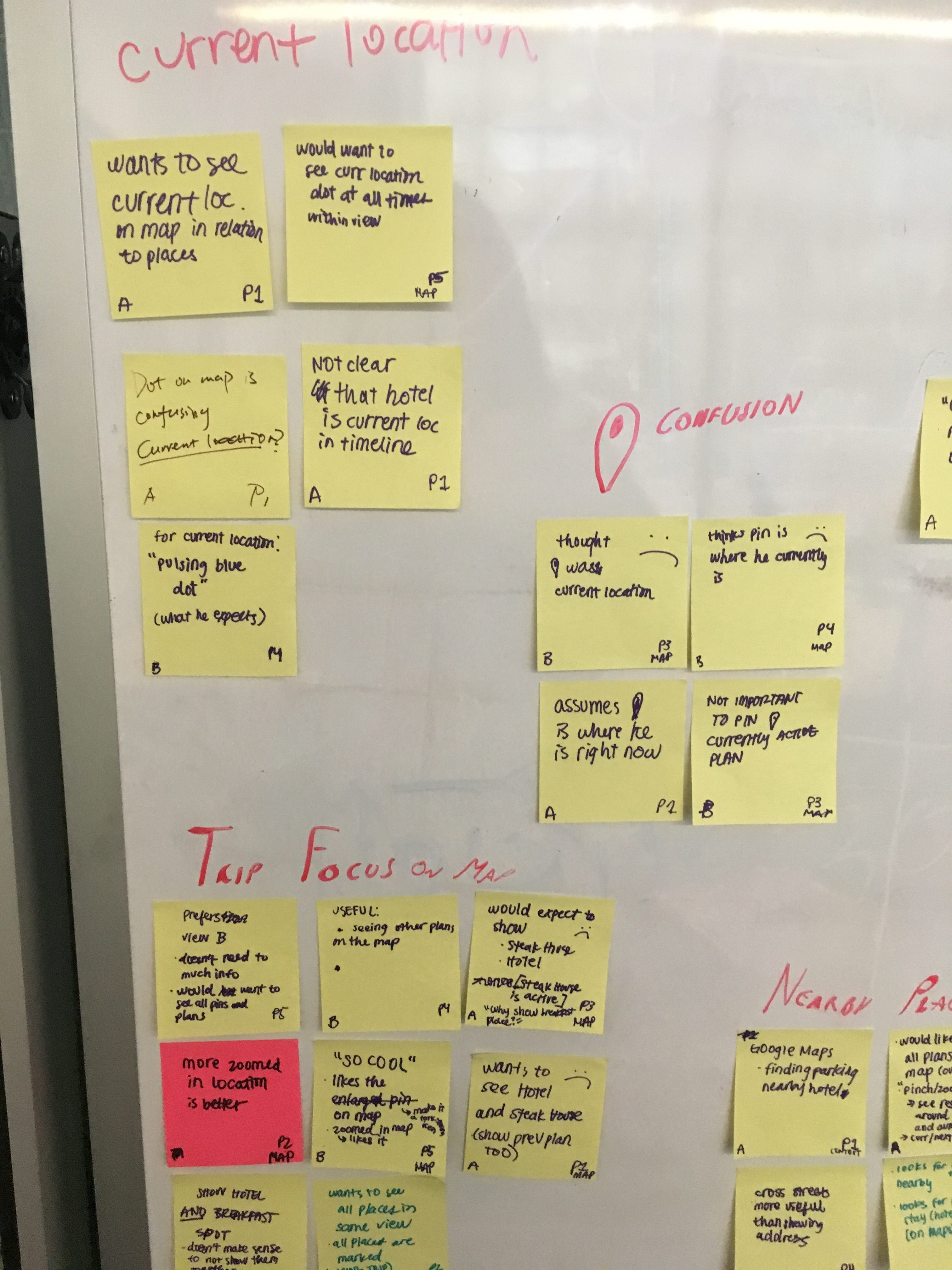
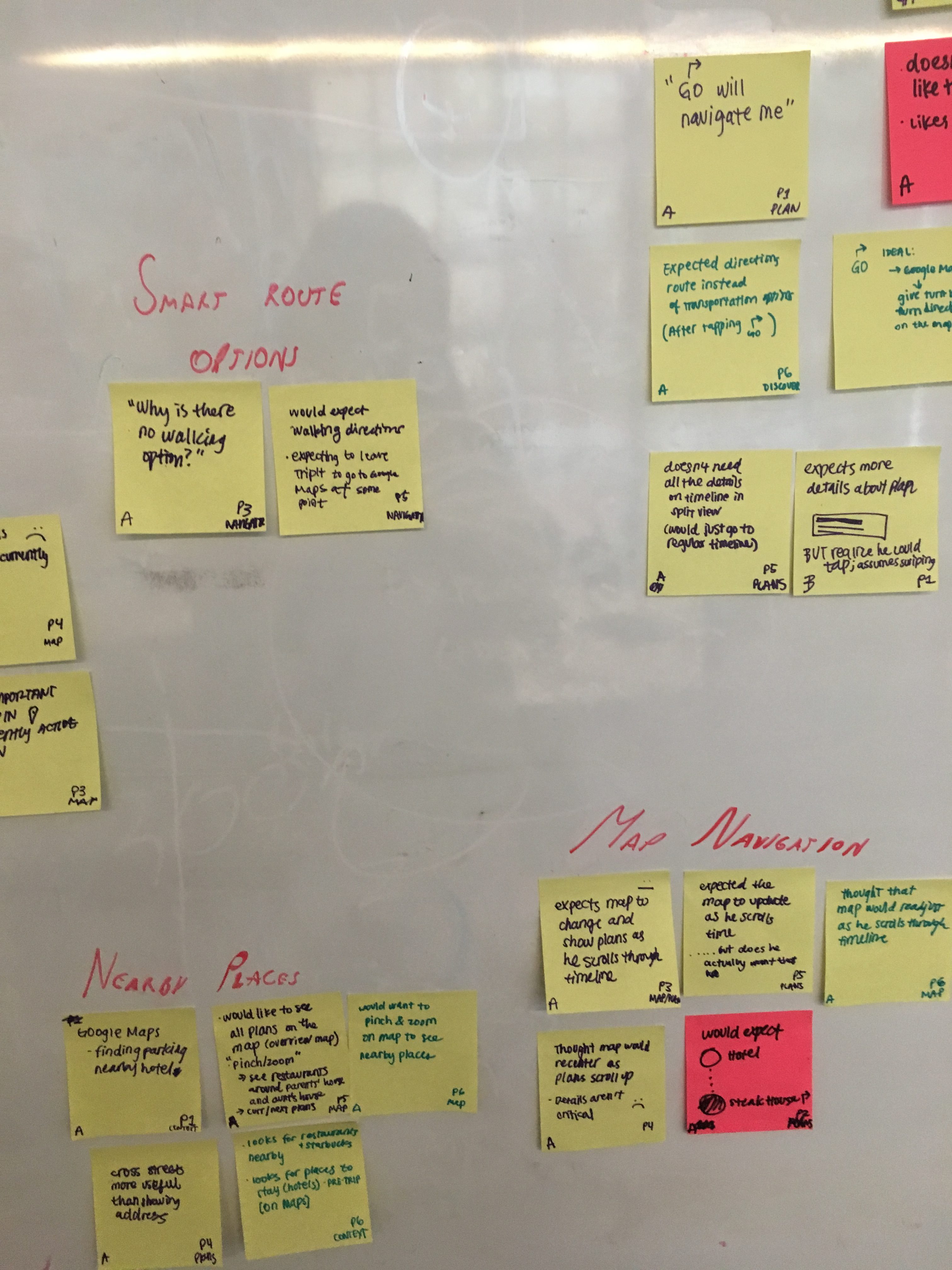
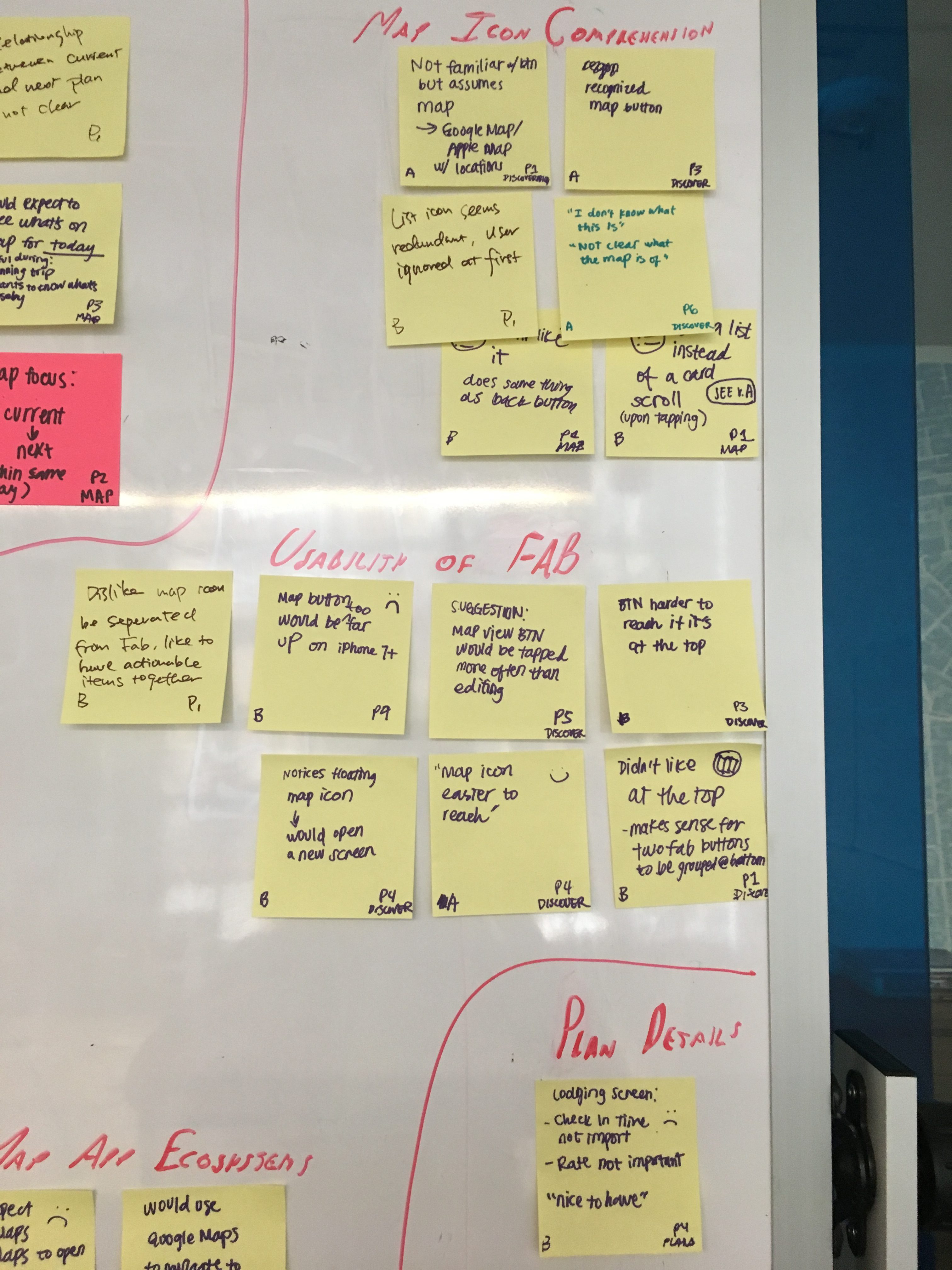
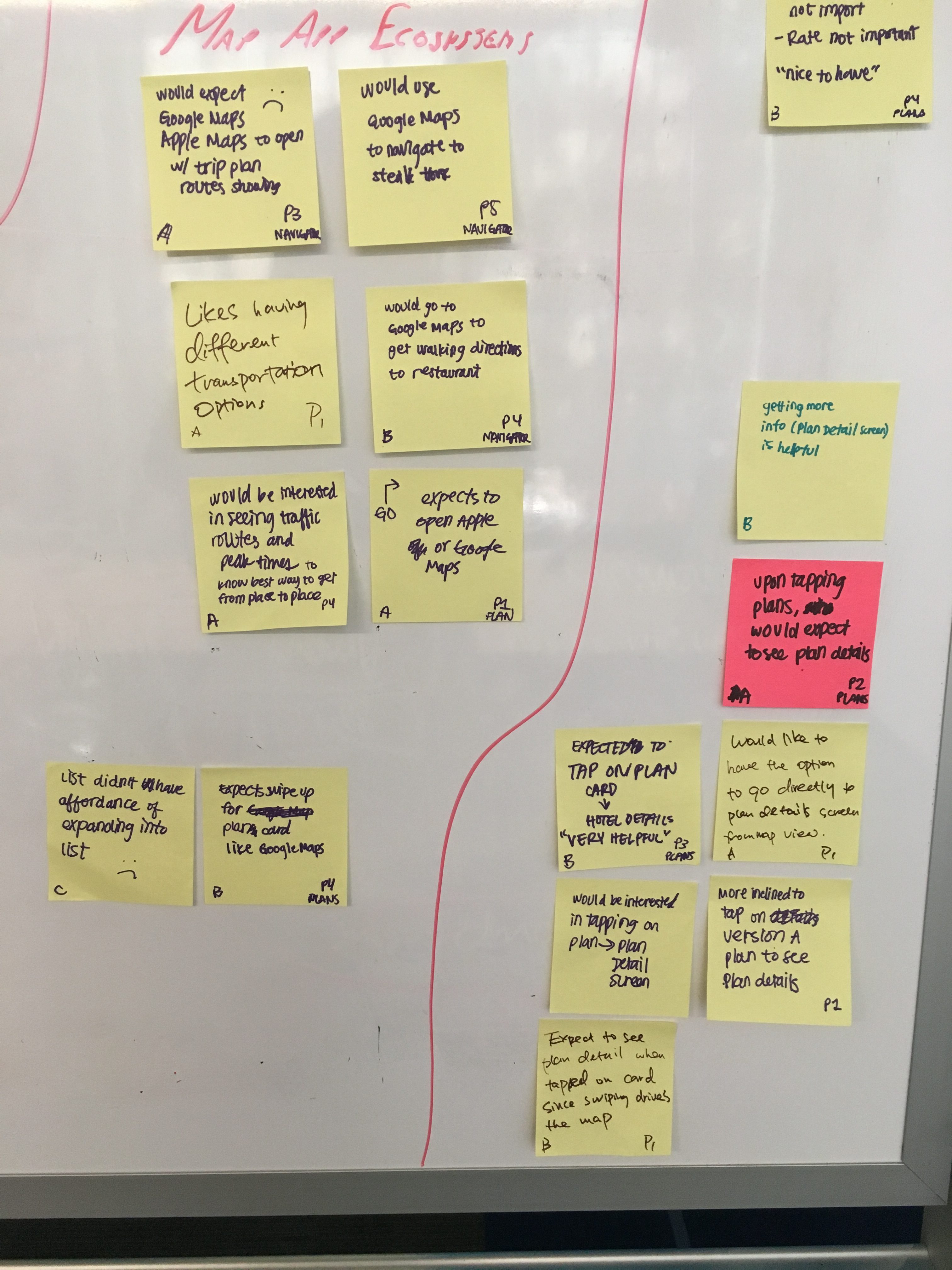
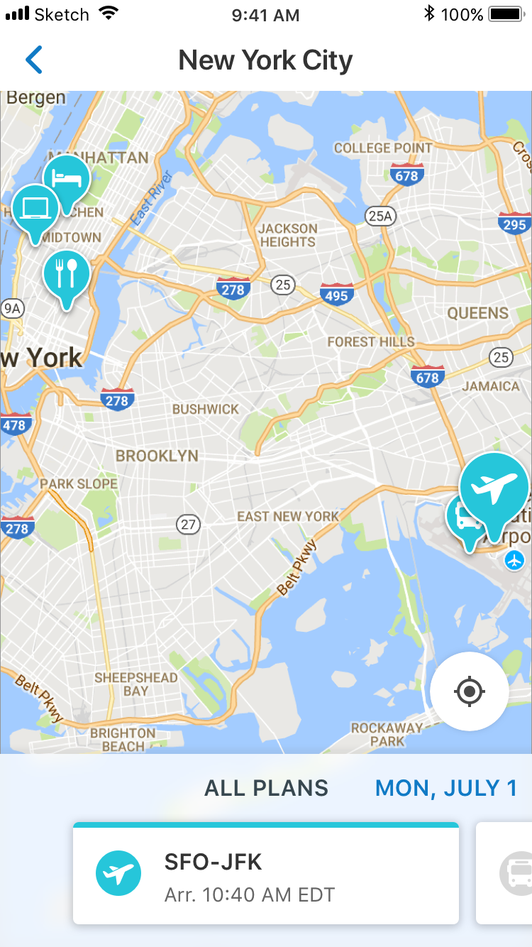
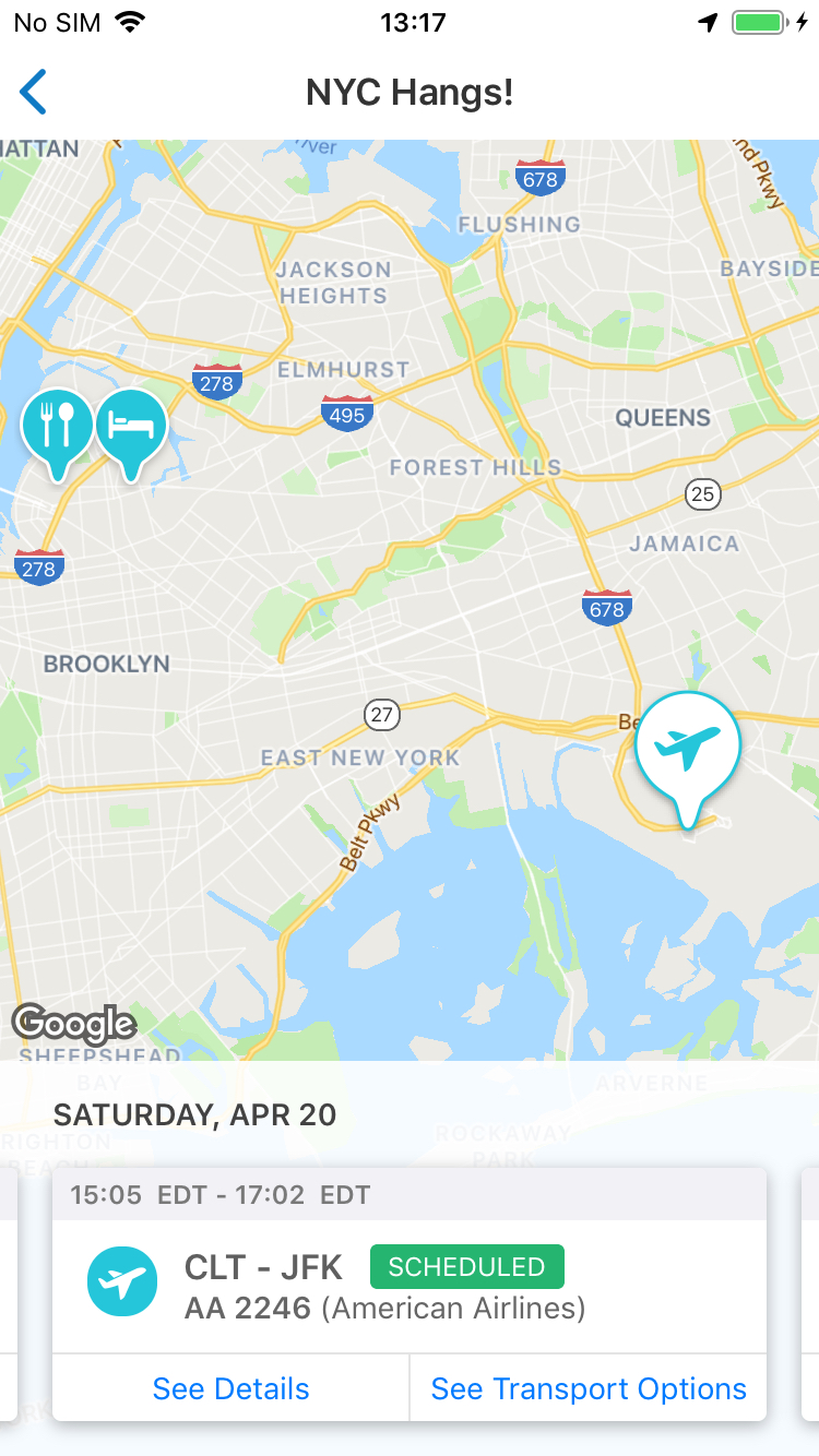
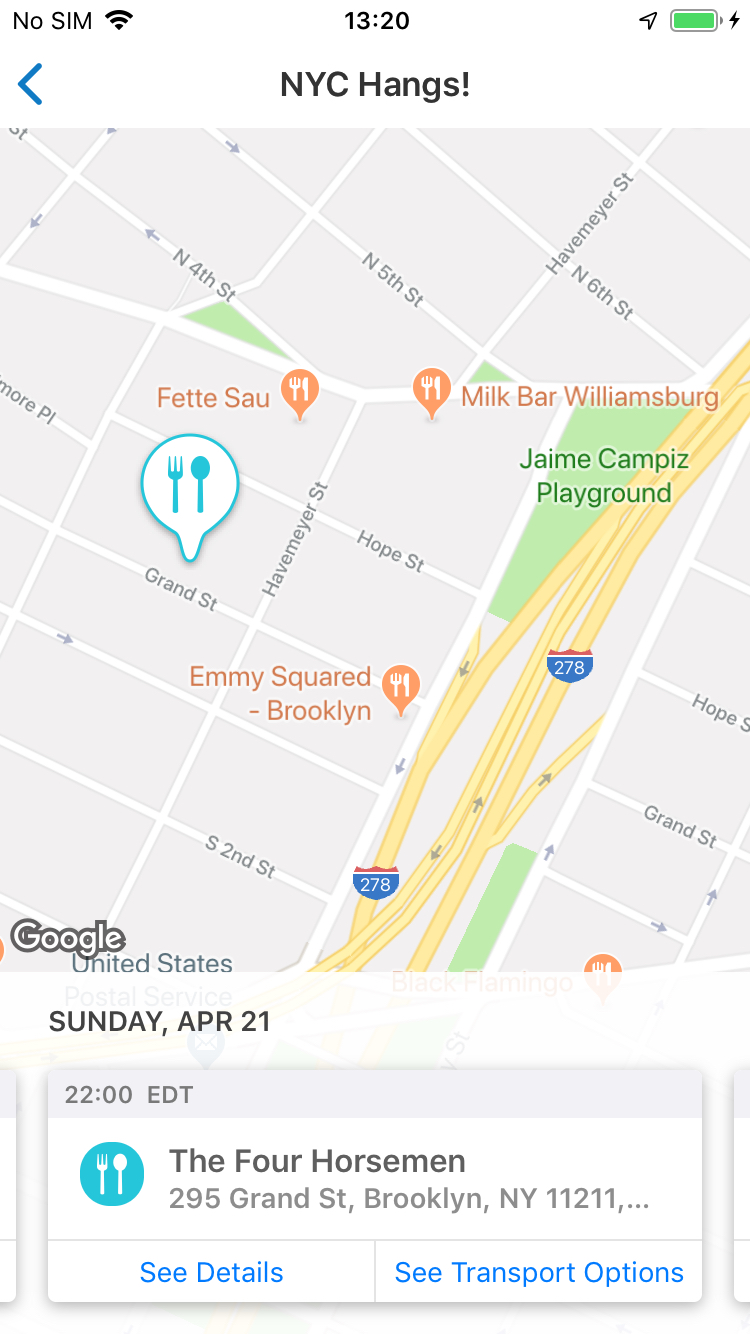
We learned that there was a whole lot of things users would find useful in a map view including Yelp-like “Find nearby” features, adding plans through the map, seeing routes and directions, saving favorite spots, finding recommendations… etc.
Though we would have wanted to offer all of these features, we needed to narrow the scope to the basics, while keeping an eye towards future iterations and feature enhancements. Through a concept prioritization workshop wherein we weighed impact versus effort, we narrowed it down to the following objectives:
Spatial Relations
Show all plans (including past) to help the user see plans in relation to each other spatially
Where are you?
Allow the user to focus on where a specific plan is to help them get their bearings
Navigator
Provide easy access to TripIt’s Navigator feature for transportation options


Clear States
One of the most important little details we identified was making the states of the icons and the cards as clear and easy to identify as possible.
There needed to be a clear distinction between the default state, the selected state, as well as past and present states.
Final MVP
Access: We added a second floating action button on the Trip Summary screen to access Map View
- Swiping through the cards drives the map to focus on that plan, switching the icon to the selected state
- Selecting on “See Details” brings you to the plan details screen
- Tapping “See Transport Options” brings the user to the Navigator feature
Measuring Success
- Primary goal is always to drive engagement and increase our MAUs or Monthly Active Users.
- We measure this by monitoring feature usage
- Most other TripIt features come in somewhere around 10% or less for feature engagement
- One month after launch, feature usage for map view is coming in at 25%
But questions always remain and there is always room for improvement and future iterations. Questions that have come up are:
- Is there enough of an affordance to show that the cards are swipe-able?
- What value might there be in adding an affordance to easily add a plan to your trip while in map view?
- How much value would it bring to create a hybrid version of the timeline and map view?


