Streamlining Plan Creation & Trip Context in TripIt Web

Following the official April 2025 new web rollout, customer feedback showed friction and regressions compared to the classic web. Top pain points included too many clicks, slower flows, missing Trip Description/Notes, and inability to view key details in a single place.

My Role: Principal UX Designer​

Led end-to-end design from early concepting through developer-ready specifications and ongoing dev support (implementation Q&A, error/edge cases). Co-drove product discovery—problem statement, user needs, and prioritization—with the Product counterpart to shape roadmap and trade-offs.

Defining The Problem

Users could not efficiently capture or view key plan and trip details at the right moment—especially during plan creation—leading to excessive navigation, incomplete entries, and loss of confidence.

Create vs. Edit friction

Users had to save a new plan before entering core details like notes/travelers/documents; performance concerns amplified the pain.

Trip context missing on web

Trip Description (present on iOS) was removed on the web, breaking workflows for storing policy numbers, booking references, and overall trip notes.

Information density & speed

Users wanted all critical info on one page with fewer clicks; print views and timeline surfaced additional pain points.

User Impact

User retention & trust: Regressions eroded confidence and generated requests to revert to classic.

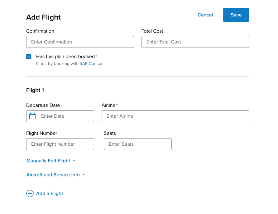
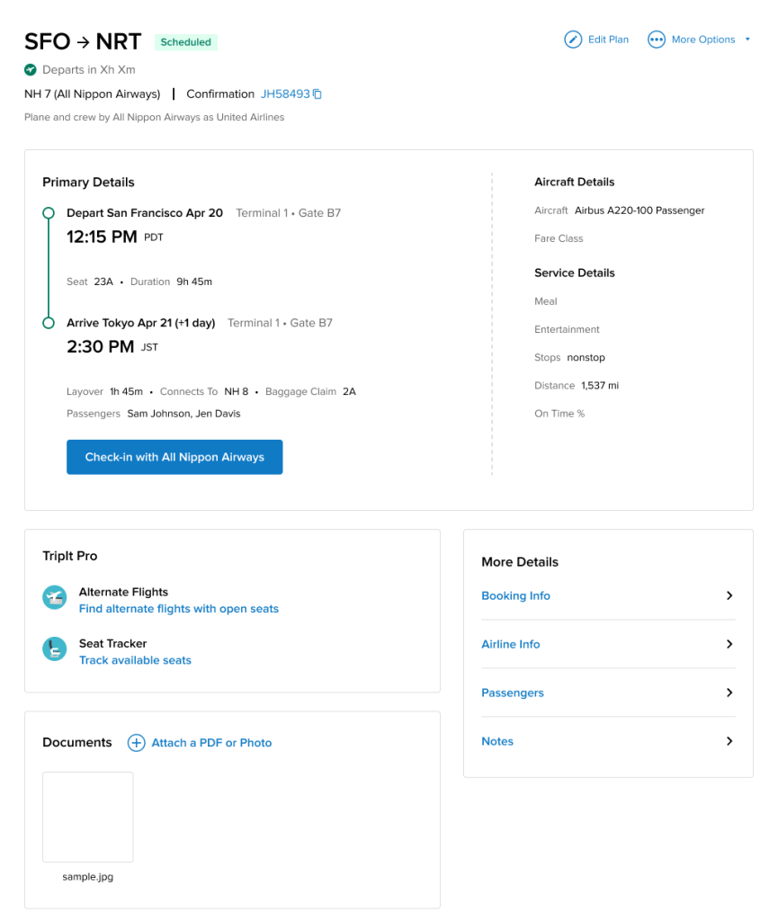
Task completion & data quality: Deferring core fields led to deferred/lost data, weakening cost tracking, passenger visibility, and documentation availability.

Cross-platform consistency: Field parity gaps undermined continuity across devices.

Goals

  1. Reduce clicks and context switching during plan creation/editing.
  2. Restore and elevate critical trip context (Trip Description; web parity).
  3. Increase information density responsibly (prioritize key fields; consolidate secondary details with accessible in-place editing).
  4. Ensure performance-friendly UI via fewer navigations and single-flow interactions.

Design Approach

  1. Restructure plan creation into a single, rich flow: Bring key fields into Add Plan (Notes, Traveler Name, Documents, Total Cost) and consolidate details to cut navigations and improve completion.

  2. Restore & elevate Trip Description: Add to Add/Edit Trip and Trip Summary on web, reinstating a critical planning surface and closing parity gaps.

  3. Rethink Primary vs. Secondary: Promote Notes and Passengers/Travelers to primary where appropriate; emphasize in-line editing.

  4. Interaction & Navigation simplification: Explore context menus and reduce full-page navigations to mitigate latency impact and maintain focus.

Process and Collaboration

  • Iterations & reviews: Ran Iteration 1–3; held design reviews; delivered a comprehensive spec package; supported dev Q&A and clarified supplier-field labeling.
  • Cross-functional alignment: Partnered with Product (prioritization), Engineering (feasibility/performance), and Analytics (validation).
  • Continuous user-data loop: Referenced consolidated feedback and prioritized WebUI fixes alongside analytics-reviewed queries.

Outcomes and Impact

Users could not efficiently capture or view key plan and trip details at the right moment—especially during plan creation—leading to excessive navigation, incomplete entries, and loss of confidence.

Efficiency

Fewer clicks and less page switching during create/edit; improved time-to-complete for common plan types.

Data completeness

Higher fill-rates for Notes, Traveler(s), Documents, Total Cost at creation.

Satisfaction

Reduction in feedback items tagged “too many clicks,” “notes missing,” “trip description missing,” and “can’t see info in one page.”

Close Menu